Business card color meanings play a significant role in shaping first impressions, communicating brand identity, and influencing how people perceive a business.
Every color used on a business card sends subtle psychological signals that affect trust, professionalism, creativity, confidence, and reliability.
Whether you’re designing a personal business card or building a company’s visual identity, choosing the right color helps reinforce your message and values.
While color meanings vary across cultures and industries, understanding color psychology can help you create a memorable and effective design.
Quick Answer:
Business card colors symbolize different brand qualities. Blue represents trust, black conveys luxury, white suggests simplicity, red expresses confidence, and green reflects growth and sustainability.
What Do Business Card Colors Symbolize?
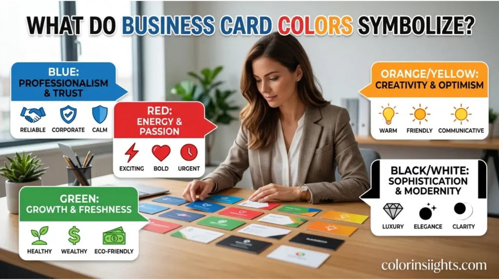
Business card colors symbolize the personality, values, and goals of a business. Unlike decorative color choices, business card colors are selected strategically to influence customer perception before a conversation even begins.
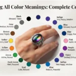
Here are some of the most common business card color meanings:
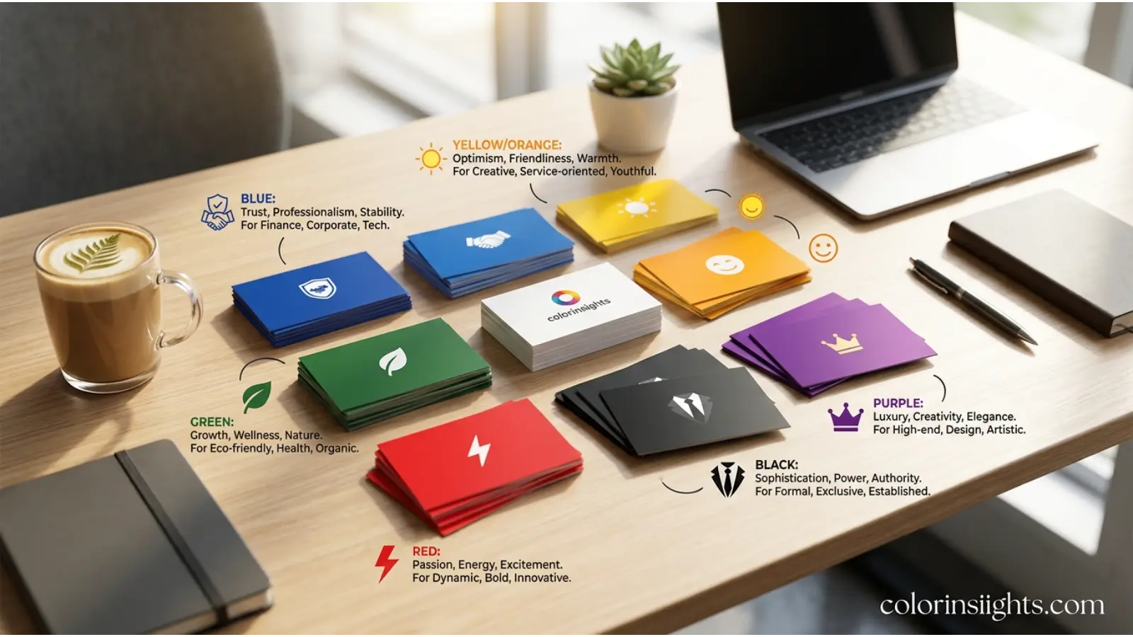
- Blue: Trust, professionalism, intelligence, and dependability.
- Black: Luxury, authority, sophistication, and exclusivity.
- White: Simplicity, honesty, cleanliness, and transparency.
- Red: Energy, passion, confidence, and action.
- Green: Growth, health, prosperity, and environmental awareness.
- Yellow: Optimism, friendliness, creativity, and happiness.
- Orange: Innovation, enthusiasm, affordability, and warmth.
- Purple: Creativity, wisdom, luxury, and imagination.
- Gray: Neutrality, balance, maturity, and stability.
- Brown: Reliability, tradition, authenticity, and comfort.
The effectiveness of a business card often depends on combining these colors with typography, layout, logo design, and paper quality to create a consistent brand identity.
Psychological Characteristics of Business Card Colors
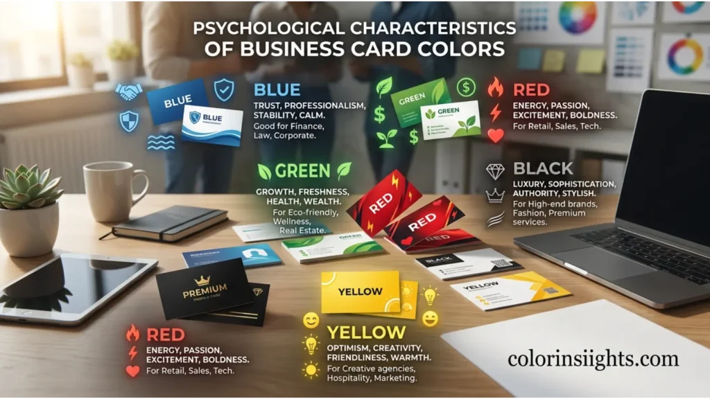
Color psychology suggests that people form opinions about visual materials within seconds. Business cards benefit from carefully selected colors because they influence emotions and purchasing decisions before any verbal communication occurs.
Emotional Associations
- Blue promotes security and confidence.
- Black communicates prestige and leadership.
- White creates feelings of openness and clarity.
- Green encourages calmness and trust.
- Red stimulates excitement and urgency.
- Yellow generates optimism and positivity.
Psychological Effects
Different colors activate different emotional responses.
- Cool colors generally reduce stress and inspire confidence.
- Warm colors attract attention and encourage action.
- Neutral colors create professionalism and timeless appeal.
Positive Emotional Responses
- Trust
- Confidence
- Professionalism
- Innovation
- Friendliness
- Stability
- Optimism
- Reliability
Negative Emotional Responses
When used excessively or without balance, colors can create unintended impressions.
- Too much black may seem intimidating.
- Bright red may appear aggressive.
- Excessive yellow can become overwhelming.
- Heavy gray may feel dull or emotionless.
- Pure white without contrast may appear plain.
Impact on Mood and Behavior
Business card colors influence whether someone perceives a company as approachable, premium, creative, or dependable. Consistent branding also improves recognition and customer recall.
Typical Reactions
People often associate:
- Blue with trustworthy financial or technology companies.
- Green with wellness and sustainability.
- Black with luxury brands.
- Red with restaurants, entertainment, and sales.
- White with healthcare and modern businesses.
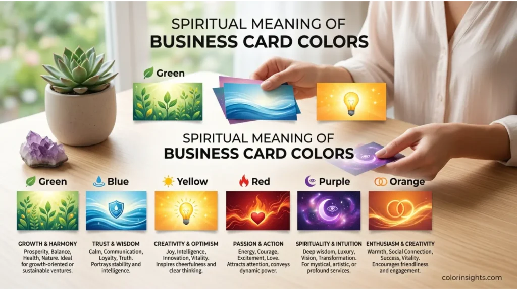
Spiritual Meaning of Business Card Colors
Although business cards primarily serve professional purposes, their colors often reflect broader symbolic meanings found in spiritual traditions around the world.
- Holiness: White symbolizes purity and sacred intentions.
- Wisdom: Purple represents higher knowledge and insight.
- Purity: White encourages honesty and ethical conduct.
- Transformation: Green reflects renewal and personal growth.
- Healing: Green and soft blue are associated with restoration and well-being.
- Protection: Blue symbolizes security and stability.
- Power: Black and deep red often represent strength and authority.
- Enlightenment: Gold and white are linked with spiritual awareness.
- New Beginnings: Green symbolizes fresh opportunities.
- Eternity: Blue often represents timelessness and lasting relationships.
These symbolic meanings can subtly reinforce a company’s mission, particularly in industries such as wellness, education, counseling, and nonprofit organizations.

Positive and Negative Meanings of Business Card Colors
Positive Meanings
Business card colors can strengthen brand perception when they align with company values.
- Purity: White business cards suggest honesty and transparency, making them popular in healthcare.
- Peace: Soft blue creates a calm, reassuring impression for consulting firms.
- Simplicity: Minimalist white and gray designs emphasize clarity.
- Clarity: Clean color combinations improve readability.
- Freshness: Green reflects innovation and environmentally friendly practices.
- Hope: Bright yet balanced colors inspire optimism.
- Balance: Neutral palettes create a professional appearance.
- Harmony: Coordinated brand colors reinforce consistency across marketing materials.
Negative Meanings
Poor color choices or excessive use can weaken a business message.
- Emptiness: Too much white space without visual hierarchy may feel unfinished.
- Isolation: Overly muted gray can appear emotionally distant.
- Coldness: Excessive blue may seem impersonal.
- Sterility: Bright white alone can resemble medical documentation.
- Boredom: Lack of color contrast reduces memorability.
- Emotional Distance: Minimal interaction between colors may appear uninviting.
- Perfectionism: Highly polished black-and-white designs can feel intimidating if not balanced with approachable typography.
Choosing complementary colors helps avoid these issues while strengthening brand communication.
Meanings of Business Card Colors
Business card color meanings change depending on industry, audience, culture, and branding objectives. A blue card may communicate trust in finance but innovation in technology. Likewise, black can represent luxury for a fashion brand while suggesting authority for a law firm.
Feng Shui
Color also plays a role in Feng Shui by influencing energy and balance.
- Associated Element: Colors correspond with the five elements—wood, fire, earth, metal, and water.
- Energy Symbolism: Blue encourages calm, green supports growth, and red activates energy.
- Best Rooms: Home offices and workspaces benefit from balanced blue, green, or neutral tones.
- Recommended Color Combinations: Blue with white, green with beige, black with gold, and gray with navy.
- Decorating Tips: Match business stationery with office décor to reinforce a cohesive professional image.
Marketing
Business card colors are a powerful branding tool.
- Branding Psychology: Colors influence brand personality and recognition.
- Consumer Perception: People often judge credibility based on color consistency.
- Trust Signals: Blue, white, and gray commonly communicate reliability.
- Product Packaging: Brands frequently match business card colors with packaging and logos for consistency.
- Advertising Applications: Consistent color usage improves recall across websites, social media, and print materials.
Examples include:
- Blue: IBM, Intel, PayPal, and Facebook emphasize trust.
- Red: Coca-Cola, Netflix, and Target create excitement.
- Green: Starbucks and Whole Foods highlight sustainability.
- Black: Chanel and Nike use black to express sophistication and confidence.
Design
Business card colors influence overall design quality.
Interior Design
Professionals often coordinate office colors with printed materials to reinforce branding.
Graphic Design
Designers use color contrast to improve readability and visual hierarchy.
Web Design
Matching website colors with business cards strengthens brand recognition.
User Experience
Consistent colors create familiarity across physical and digital touchpoints.
Minimalist Aesthetics
Simple color palettes often appear more elegant and memorable than overly colorful designs.
Fashion
Business card colors can complement personal branding and professional appearance.
- Clothing Symbolism: Coordinating business cards with professional attire creates visual consistency.
- Seasonal Use: Bright colors work well for spring promotions, while darker palettes suit luxury brands year-round.
- Styling Effects: Matte black conveys sophistication, while white projects modern simplicity.
- Personality Impressions: Creative professionals often choose vibrant colors, whereas legal and financial professionals usually prefer conservative palettes.
- Advantages: Strong brand recognition, memorable networking, and consistent identity.
- Disadvantages: Trend-driven colors may become outdated or fail to appeal to every audience.
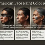
Color Associations Are Not Universal
Business card color meanings vary significantly across cultures, traditions, and historical contexts.
Western Cultures
In the United States and much of Europe, blue represents trust, white symbolizes cleanliness, black conveys sophistication, and green reflects sustainability. These associations commonly influence corporate branding.
Eastern Cultures
Many East Asian cultures associate red with luck, celebration, and prosperity. White may symbolize mourning in some traditions, while gold often represents wealth and success.
Religious Traditions
Religious symbolism also shapes color interpretation. White often represents purity, green symbolizes paradise in Islamic traditions, purple reflects spiritual authority in Christianity, and saffron holds deep significance in Hinduism and Buddhism.
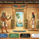
Historical Interpretations
Historically, purple was reserved for royalty due to the rarity of purple dye. Gold represented wealth and influence, while black evolved from a symbol of mourning to one of luxury and elegance.
Modern Global Interpretations
Global businesses increasingly consider multicultural audiences when selecting business card colors. International brands often favor universally trusted colors like blue and neutral tones while adapting campaigns for regional preferences.
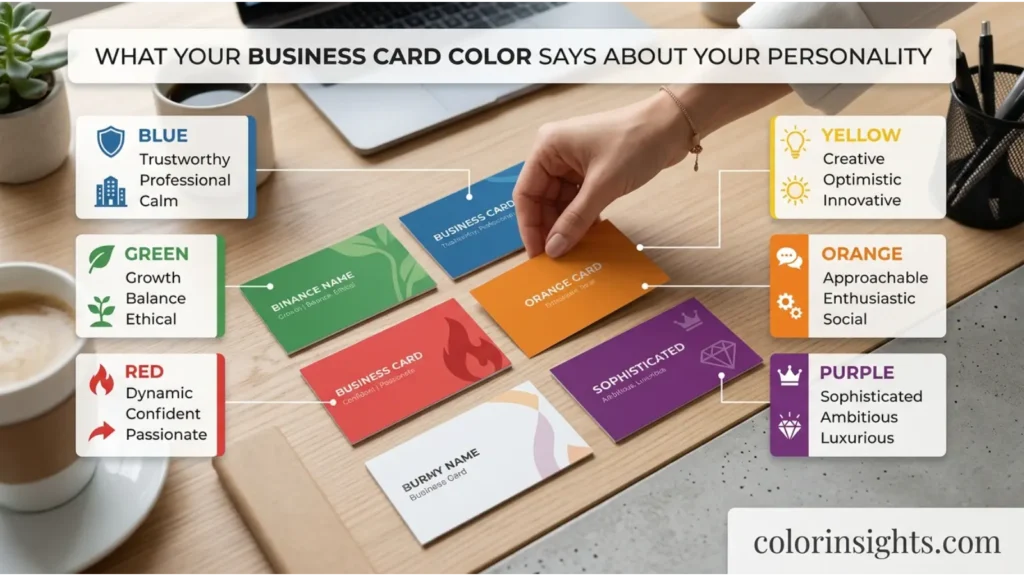
What Business Card Colors Say About Your Personality
People often choose business card colors that reflect their professional identity and communication style. However, color preferences alone cannot accurately determine personality, as personal experiences, cultural influences, and branding objectives all shape these decisions.
Strengths
Someone who prefers certain business card colors may value:
- Professionalism
- Creativity
- Confidence
- Reliability
- Innovation
- Organization
- Leadership
Weaknesses
Depending on the chosen palette, others may perceive:
- Excessive formality
- Emotional reserve
- Risk-taking tendencies
- Perfectionism
- Conservatism
- Overconfidence
Social Behavior
Warm colors often create an approachable image, while cool colors communicate calm professionalism. Neutral colors usually suggest maturity and balance.
Work Style
Blue and gray may indicate structured thinking, green suggests collaboration, black reflects ambition, and orange often communicates creativity and adaptability.
Relationships
Professionals who favor welcoming color combinations generally appear more approachable during networking events, while darker palettes may emphasize expertise and authority.
Emotional Tendencies
Color preferences can reflect emotional comfort zones rather than fixed personality traits. They should be viewed as one aspect of personal branding instead of a scientific measure of character.
FAQs
What defines business card color meanings?
Business card color meanings describe how different colors influence perceptions of a company’s personality, professionalism, trustworthiness, and brand identity.
What do business card colors symbolize?
They symbolize qualities such as trust, authority, creativity, innovation, reliability, sustainability, confidence, and luxury.
Why are business card colors important?
Colors shape first impressions, strengthen brand recognition, improve memorability, and communicate professionalism before any conversation begins.
Are business card colors considered warm or cool?
Business cards can use both. Warm colors like red and orange create excitement, while cool colors like blue and green communicate trust and calmness.
What emotions do business card colors represent?
Depending on the color, they may represent confidence, security, optimism, creativity, peace, energy, or stability.
What is the spiritual meaning of business card colors?
Many colors carry symbolic meanings related to wisdom, healing, transformation, protection, prosperity, and new beginnings, although interpretations vary across cultures.
What colors pair well on business cards?
Popular combinations include blue and white, black and gold, green and white, navy and gray, black and silver, and white with subtle accent colors.
What do business card color preferences say about a person?
They may reflect branding goals or personal style, but they do not reliably predict personality traits.
Which business card color is best for trust?
Blue is widely considered the strongest color for communicating trust, dependability, and professionalism.
Should businesses use multiple colors on a business card?
Yes. A balanced color palette with one dominant color and complementary accents often creates a more memorable and visually appealing design.
Conclusion:
Business card color meanings extend beyond aesthetics. Every color influences how customers perceive credibility, professionalism, creativity, and brand values.
Selecting the right color combination helps businesses communicate their identity, improve brand recognition, and leave a lasting first impression.
While color psychology offers valuable guidance, effective business card design also depends on typography, layout, contrast, and audience expectations.
By understanding both the psychological and cultural meanings of color, businesses can create cards that communicate their message clearly and support long-term branding success.