Color Wheel and Meanings is more than a visual chart used to organize hues. It is a practical framework for understanding relationships among colors, including primary, secondary, and tertiary hues, as well as complementary, analogous, and contrasting combinations.
Because different colors can influence perception, emotion, communication, and visual attention, the color wheel has become important in art, interior design, fashion, branding, marketing, and education. Its meanings depend on the individual color, its saturation and brightness, and the context in which it appears.
Quick answer:
the Color Wheel Meaning represents the relationships, emotional associations, and visual harmony created among colors, helping people understand how colors interact and communicate.
What Does the Color Wheel Symbolize?
The color wheel symbolizes color relationships, balance, contrast, harmony, and visual communication. Unlike a single color, it does not have one universal emotional meaning. Instead, it provides a framework for understanding how different hues interact.
Traditional color wheels commonly begin with three primary colors—red, yellow, and blue—in traditional artistic models. Mixing primary colors produces secondary colors such as orange, green, and violet. Between these are tertiary colors, including combinations such as red-orange, yellow-green, and blue-violet.
The position of a color on the wheel can also communicate relationships:
- Complementary colors sit opposite each other and create strong contrast.
- Analogous colors appear next to one another and generally produce visual continuity.
- Triadic colors form a three-point relationship around the wheel.
- Warm colors, typically reds, oranges, and yellows, are often associated with energy and activity.
- Cool colors, commonly greens, blues, and violets, are frequently associated with calmness, nature, or introspection.
Therefore, the color wheel symbolism is fundamentally about relationships rather than a single fixed message.
Psychological Characteristics of the Color Wheel
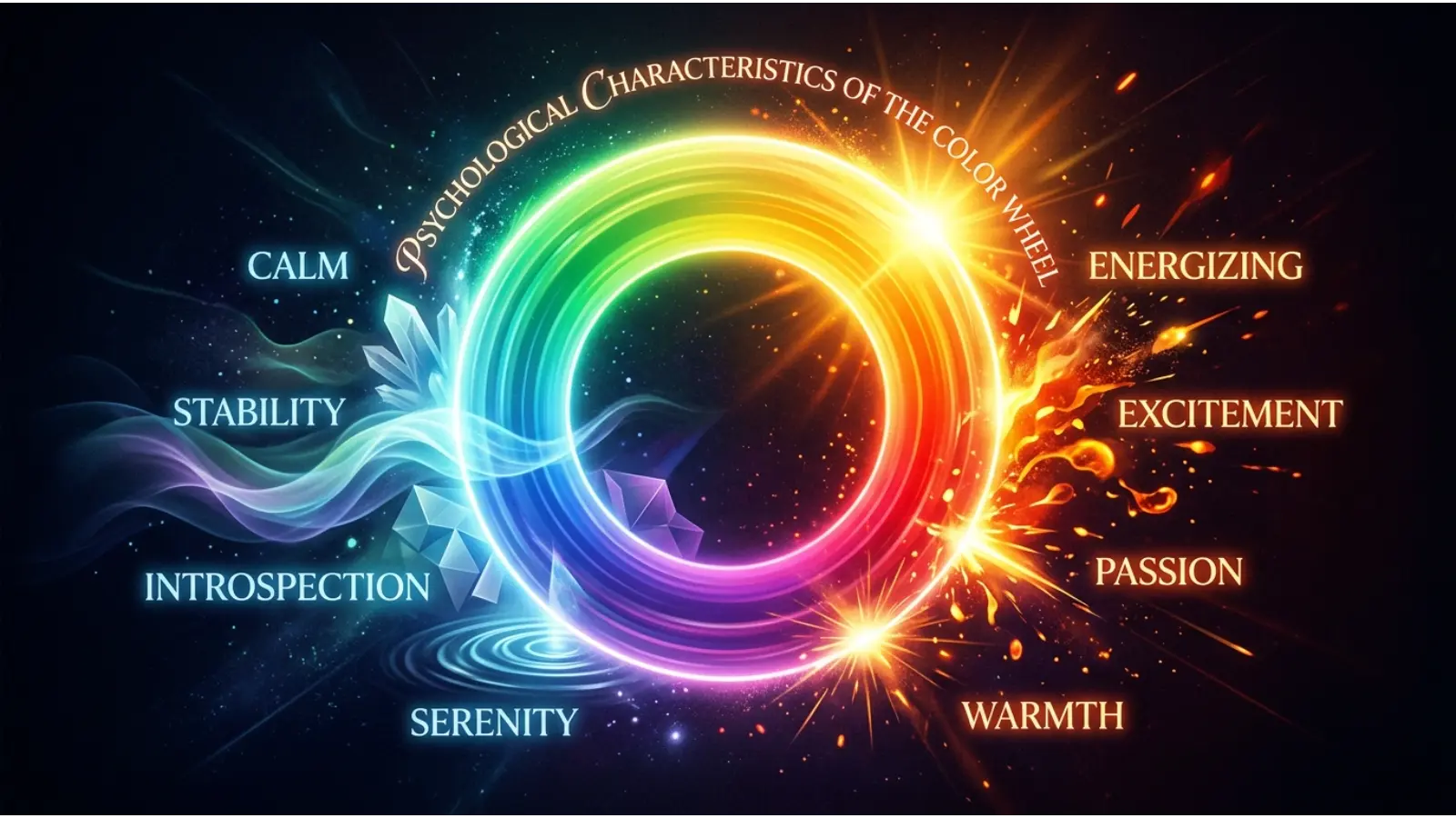
The psychology of the color wheel involves understanding how individual hues and combinations may influence perception, attention, mood, and behavior. Color psychology is context-dependent: responses can vary according to culture, personal experience, lighting, saturation, and surrounding colors.
Emotional Associations
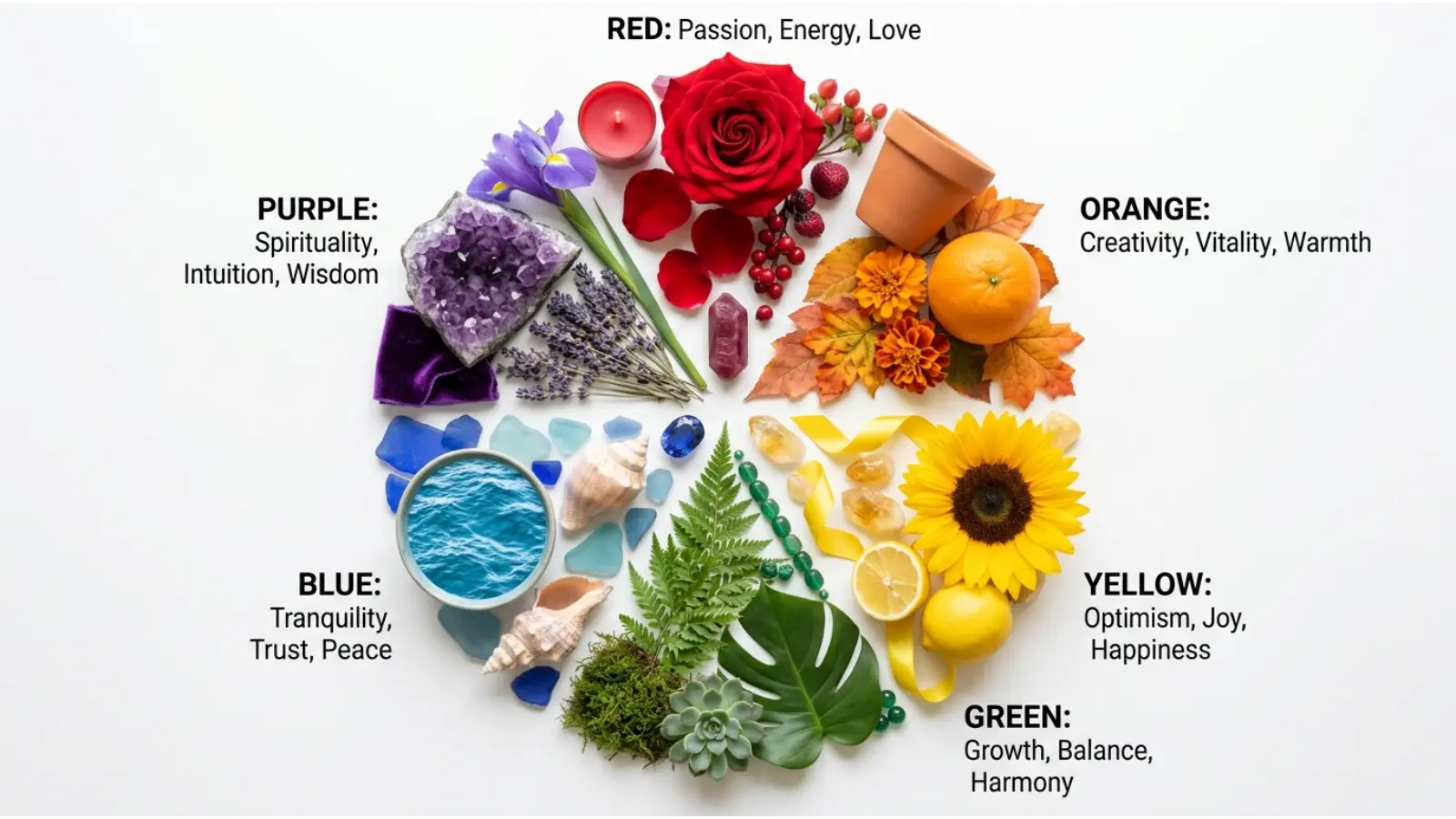
Different sections of the wheel tend to evoke different associations:
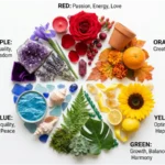
- Red: energy, urgency, passion, excitement, and intensity.
- Orange: enthusiasm, warmth, creativity, and sociability.
- Yellow: optimism, attention, brightness, and cheerfulness.
- Green: nature, renewal, balance, and growth.
- Blue: calmness, stability, trust, and professionalism.
- Violet: imagination, luxury, spirituality, and introspection.
These are common associations rather than guaranteed psychological reactions.
Psychological Effects
Color combinations can change how people interpret visual information. Strong complementary contrasts can attract attention, while analogous palettes may create a smoother and more unified appearance.
Saturation also matters. Highly saturated colors can appear energetic or attention-grabbing, whereas muted colors may feel softer, understated, or sophisticated.
Positive Emotional Responses
Depending on context, harmonious color combinations may communicate:
- Energy and enthusiasm
- Calm and relaxation
- Creativity
- Optimism
- Security
- Balance
- Freshness
- Sophistication
Negative Emotional Responses
Certain combinations can also produce less comfortable impressions:
- Excessive visual stimulation
- Confusion
- Aggression
- Coldness
- Visual fatigue
- Emotional distance
- Overwhelming contrast
For example, using several highly saturated complementary colors in a small interface can make the design feel visually busy.
Impact on Mood and Behavior
Color can influence attention and expectations, but it should not be treated as a simple behavioral control mechanism. A restaurant, website, classroom, or bedroom may use color strategically to create a particular atmosphere, yet lighting, typography, layout, sound, temperature, and cultural expectations also contribute to the overall experience.
How People Typically React
People often notice strong contrasts quickly. Complementary colors can make one another appear more vivid, while analogous colors generally blend more naturally. This makes the color wheel particularly useful for artists and designers who need to control emphasis, hierarchy, and visual balance.
Spiritual Meaning of the Color Wheel
The spiritual meaning of the color wheel comes from the symbolic traditions attached to individual colors and their relationships. Many spiritual systems assign meanings to colors, although interpretations differ significantly between religions, cultures, and historical periods.
The color wheel can symbolically represent:
- Holiness: White, gold, blue, and other colors may represent sacredness in particular traditions.
- Wisdom: Blue, violet, gold, and white have been associated with wisdom in different symbolic systems.
- Purity: White is frequently connected with purity, innocence, or cleansing.
- Transformation: Violet, orange, and other changing or transitional hues can symbolize transformation.
- Healing: Green is commonly connected with nature, renewal, and restoration.
- Protection: Certain colors are used symbolically as protective or sacred colors in religious and spiritual practices.
- Power: Red, gold, purple, and black can communicate authority or strength depending on the tradition.
- Enlightenment: White, gold, yellow, and violet can carry associations with illumination or spiritual awareness.
- New beginnings: Green, yellow, white, and other fresh or light hues can symbolize renewal.
- Eternity: Blue, white, gold, and circular imagery can sometimes represent continuity or timelessness.
The wheel itself can also symbolize wholeness and interconnectedness, because every hue occupies a position within a larger visual system.
Positive and Negative Meanings of the Color Wheel
Because the color wheel contains many colors, its positive and negative meanings are best understood through the relationships and contexts it represents.
Positive Meanings
Harmony: Analogous and carefully balanced palettes can create a cohesive visual experience. Interior designers often combine neighboring hues to create continuity between rooms.
Balance: The wheel helps designers distribute visual weight among colors. A neutral background paired with a carefully selected accent can prevent a composition from feeling chaotic.
Clarity: Understanding complementary and analogous relationships can make visual communication easier. For example, contrasting text and background colors can improve visual separation.
Freshness: Green, yellow, turquoise, and other lighter combinations may communicate renewal or freshness, particularly in environmental or wellness-related design.
Hope and optimism: Yellow and green frequently appear in visual identities intended to communicate positivity, growth, or renewal.
Creativity: A broad palette can communicate experimentation and imagination, especially in art, fashion, and creative branding.
Harmony: Color schemes based on established wheel relationships can provide predictable visual cohesion.
Energy: Warm colors and strong contrasts can make posters, advertisements, sports graphics, and event materials feel active and dynamic.
Negative Meanings
Overstimulation: Using too many highly saturated colors can make a design difficult to process.
Isolation: A single color surrounded by large areas of neutral space may appear emotionally distant depending on the design context.
Coldness: Blue, blue-gray, or desaturated palettes can sometimes create a cool or impersonal atmosphere.
Sterility: Very pale blue-white or gray-white environments can feel clinical when warmth and texture are absent.
Boredom: A poorly balanced monochromatic palette may lack sufficient contrast or visual interest.
Emotional distance: Certain cool or muted combinations can appear reserved or detached.
Perfectionism: Highly controlled color systems can sometimes communicate precision and order, but excessive uniformity may make a design feel rigid.
For example, a healthcare website may use blue and white to communicate cleanliness and reliability, while excessive use of the same cool colors could make the interface feel impersonal.
Meanings of the Color Wheel
The Color Wheel Meaning changes according to the context in which the wheel is used. In painting, it helps artists mix and contrast pigments. In graphic design, it supports palette creation. In branding, it helps companies choose colors that communicate a desired identity. In fashion, it assists with outfit coordination.
The wheel can therefore be viewed as a visual vocabulary. Individual colors provide words, while combinations create phrases and broader messages.
Feng Shui
Traditional Feng Shui uses colors in relation to the five elements: Wood, Fire, Earth, Metal, and Water. Color associations can vary among schools and practitioners, so the color wheel should not be treated as a universal Feng Shui rulebook.
- Red and orange: commonly connected with Fire and active energy.
- Green: commonly associated with Wood and growth.
- Yellow and earthy tones: often associated with Earth.
- White and metallic shades: commonly connected with Metal.
- Blue and black: frequently associated with Water.
For home decorating, color choices should also consider room function, natural light, and personal comfort. Soft greens may work well in spaces intended to feel natural, while warm accents can add energy to social areas.
Marketing
Color is an important component of visual identity and brand recognition. The color wheel in marketing helps businesses develop palettes that distinguish their products and establish visual consistency.
Branding psychology often connects:
- Red with energy and urgency
- Blue with reliability and professionalism
- Green with nature and growth
- Yellow with optimism and visibility
- Orange with enthusiasm
- Purple with creativity or premium positioning
Famous brands such as Coca-Cola, McDonald’s, Starbucks, and IBM have used distinctive color identities, although brand meaning comes from much more than color alone.
Packaging designers may use complementary colors to increase shelf visibility, while analogous palettes can create a refined and coordinated appearance. Advertising campaigns also use contrast to direct attention toward calls to action, products, or important information.
Design
The color wheel in design provides a foundation for building intentional color palettes.
In interior design, analogous palettes can create continuity, while complementary accents can add focal points.
In graphic design, complementary colors can establish strong visual hierarchy. Designers may also use triadic schemes when they want several distinct accent colors.
In web design, color contrast helps separate buttons, navigation, backgrounds, and content areas. Accessibility should always be considered rather than relying on color alone to communicate information.
In user experience design, consistent colors can help users recognize interactive elements and understand interface states.
For minimalist aesthetics, designers often combine neutral colors with one carefully selected accent from the wheel. This approach creates visual restraint without eliminating personality.
Fashion
The color wheel in fashion helps people coordinate clothing, accessories, and makeup.
Complementary combinations can create dramatic outfits, while analogous colors tend to produce a more coordinated appearance. Neutral shades such as black, white, gray, beige, and navy can provide flexibility when combined with brighter hues.
Seasonal fashion often shifts toward lighter or brighter palettes in spring and summer and deeper or earthier combinations in fall and winter, although contemporary fashion does not follow these conventions rigidly.
Practical examples include:
- Blue with orange for strong contrast.
- Green with yellow-green for an organic, harmonious appearance.
- Purple with pink for a creative, expressive palette.
- Navy with white for a clean, classic combination.
- Red with neutral tones when red is intended to become the visual focal point.
Advantages of using the wheel include easier coordination and intentional contrast. A disadvantage is that strict color rules can limit creativity if followed too rigidly.
Color Associations Are Not Universal
Western Cultures
In many Western contexts, red can suggest love, danger, energy, or urgency; blue can suggest trust and stability; green may suggest nature or environmental awareness; and white can suggest cleanliness or simplicity. However, these associations differ among countries and situations. For example, white is commonly associated with weddings in the United States, while mourning traditions elsewhere may use white or other colors.
Eastern Cultures
Color symbolism across Asian cultures is diverse rather than uniform. Red may carry associations with celebration, prosperity, luck, or happiness in parts of East Asia. White can have mourning associations in some East Asian traditions. These meanings demonstrate why marketers and designers should research the specific cultural audience rather than assuming a universal interpretation.
Religious Traditions
Religious symbolism can give colors additional meanings. Christianity, Judaism, Islam, Hinduism, Buddhism, and other traditions have developed distinct uses of color in clothing, architecture, festivals, sacred art, and ritual settings. The same color can therefore communicate different ideas depending on the religious context.
Historical Interpretations
Color meanings have changed over time. The availability and cost of pigments historically affected their cultural status. Purple, for instance, became associated with wealth and authority in several historical societies partly because some purple dyes were difficult and expensive to produce.
Modern Global Interpretations
Global media and international commerce have created some shared color conventions, but local traditions remain influential. Digital platforms, multinational brands, and global fashion can spread color trends quickly. Even so, effective communication requires considering the audience, industry, culture, and context.
What Color Wheel Says About Your Personality
People sometimes use color preferences as a way to describe personality, but liking a particular color does not scientifically determine personality. Preferences can be shaped by memories, culture, fashion, environment, experiences, and personal associations.
Someone who frequently prefers colorful palettes may be described informally as:
- Creative: Enjoying experimentation with different combinations.
- Expressive: Using color as a way to communicate individuality.
- Open to variety: Comfortable with multiple visual styles.
- Detail-oriented: Interested in subtle differences between hues.
- Balanced: Drawn to harmonious and coordinated palettes.
Potential weaknesses attributed to color enthusiasts might include becoming overly concerned with aesthetics or having difficulty narrowing down choices. However, these are descriptive stereotypes rather than reliable personality measurements.
In social behavior, a person’s clothing or environment may communicate aspects of identity, but observers can easily misinterpret these signals. At work, a designer may consciously use color theory as part of a professional skill rather than because of a particular personality trait.
In relationships, color preferences may become shared forms of expression, such as choosing a favorite palette for a home or event. Emotionally, individuals may associate certain colors with memories or experiences that are highly personal.
The most accurate interpretation is therefore that color preference can provide clues about personal taste and cultural associations, but it cannot define someone’s personality with certainty.
Frequently Asked Questions
What defines a color wheel?
A color wheel is a circular visual organization of colors that demonstrates relationships among hues. Traditional models commonly show primary, secondary, and tertiary colors and are used to understand harmony and contrast.
What does the color wheel symbolize?
The color wheel symbolizes color relationships, harmony, contrast, balance, creativity, and visual organization. Its meaning comes from the relationships among individual hues rather than from one fixed symbolic message.
Why is the color wheel important?
The color wheel is important because it gives artists, designers, educators, marketers, and creators a practical framework for selecting and combining colors.
Is the color wheel warm or cool?
The color wheel itself is neither exclusively warm nor cool. It contains both warm hues, such as red, orange, and yellow, and cool hues, such as blue, green, and violet.
What emotions do color wheel colors represent?
Different colors are associated with different emotional responses. Red can suggest energy, blue calmness or stability, green renewal, yellow optimism, orange enthusiasm, and violet imagination or spirituality.
What does the color wheel mean spiritually?
Spiritually, the color wheel can symbolize wholeness, interconnectedness, transformation, and the diversity of symbolic color traditions. Individual colors may carry specific meanings within particular religions or spiritual systems.
What colors pair well according to the color wheel?
Complementary pairs, such as blue and orange or red and green, create strong contrast. Analogous colors, such as blue, blue-green, and green, generally create more visual harmony.
What does liking many colors say about a person?
A preference for varied colors may reflect an appreciation for creativity, visual variety, or experimentation, but color preference alone cannot establish specific personality traits.
What is color harmony?
Color harmony refers to combinations that appear visually balanced or pleasing. Common approaches include complementary, analogous, monochromatic, and triadic color schemes.
How is the color wheel used in branding?
Brands use color relationships to develop recognizable palettes, create contrast, establish hierarchy, and communicate visual identity. Color is only one component of broader branding strategy.
Why do color meanings differ across cultures?
Color meanings develop through history, religion, social customs, language, geography, and shared experiences. Consequently, the same color may communicate very different ideas in different cultures.
Conclusion
The Color Wheel Meaning is fundamentally about relationships among colors and the ways those relationships influence visual communication. By organizing hues into primary, secondary, and tertiary categories and showing complementary, analogous, and other relationships, the color wheel provides a practical foundation for art, design, fashion, marketing, branding, and interior decoration. Color psychology can help explain common emotional associations, but those associations are not universal or deterministic. Cultural traditions, personal experiences, context, saturation, lighting, and surrounding colors all affect interpretation. Used thoughtfully, the color wheel allows creators to build palettes that communicate harmony, contrast, energy, calmness, creativity, or sophistication while leaving room for cultural and individual differences.