Cancer awareness ribbons use color to communicate complex ideas—support, remembrance, advocacy, and hope—at a glance. Each ribbon hue is associated with a specific cancer type or cause, and over time, these colors have accumulated layered meanings in psychology, spirituality, culture, and design.
This article explains what each cancer ribbon color symbolizes, why colors matter in awareness campaigns, and how color psychology shapes perception and action.
Quick answer:
cancer ribbon colors serve as visual shorthand—pink for breast cancer and compassion, lavender for all cancers and unity, gold for childhood cancers and courage, teal for ovarian cancer and vigilance, orange for leukemia and energy, and many more—helping people signal support and mobilize communities.
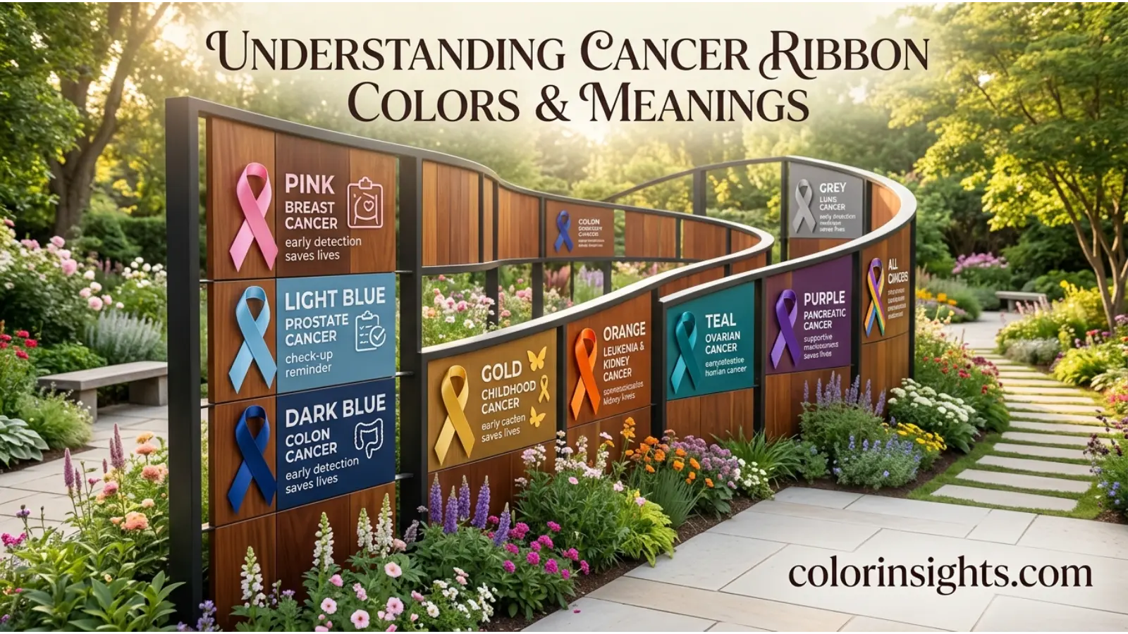
What Does the Cancer Ribbon Colors Symbolize?
“Cancer ribbon colors” is a system of color symbolism used to identify cancer types and related causes, foster solidarity, and drive public awareness. The palette functions as a shared visual language:
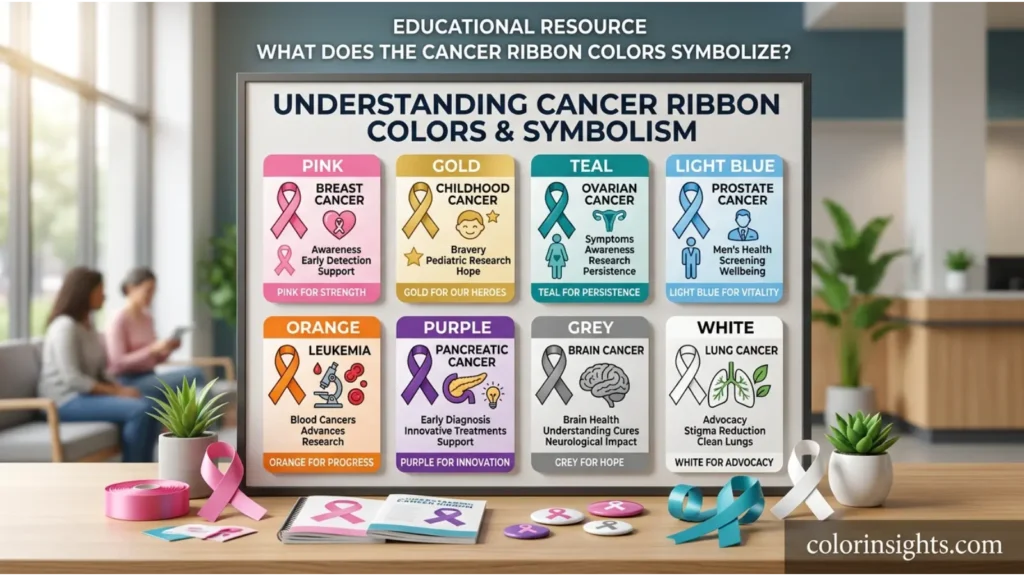
- Pink: Breast cancer, compassion, survivorship, and community support.
- Lavender: All cancers, unity, remembrance, and collective advocacy.
- White: Lung cancer (also pearl), purity of breath, clarity, and new beginnings.
- Pearl: Lung cancer, resilience, and delicate strength.
- Gold: Childhood cancer, preciousness of life, courage, and protection.
- Teal: Ovarian cancer, vigilance, intuition, and advocacy for early detection.
- Orange: Leukemia, vitality, action, and fundraising momentum.
- Yellow: Sarcoma/bone cancer and general hope or “support our troops”-style solidarity in some contexts.
- Purple: Pancreatic cancer and general cancer survivorship; dignity, transformation, and remembrance.
- Light Blue: Prostate cancer; calm strength and openness to screening.
- Dark Blue: Colon/colorectal cancer; stability, trust, and prevention messaging.
- Black: Melanoma; gravity, awareness of sun safety, and memorialization.
- Grey: Brain cancer; neutrality, complexity, and perseverance.
- Green: Liver cancer, gallbladder/bile duct cancers, and organ donation awareness; renewal and healing.
- Burgundy/White: Head and neck cancers; resolve and clarity.
- Periwinkle: Stomach/esophageal cancer; gentleness and support.
- Lime Green: Lymphoma; vitality, renewal, and survivor identity.
- Peach: Uterine cancers in some usages; warmth and care.
- Lavender/Purple (general): Caregiver support and all-cancer unity.
Note:
Associations can vary by organization and country. Many nonprofits publish official color lists; always verify when creating materials for a specific campaign.
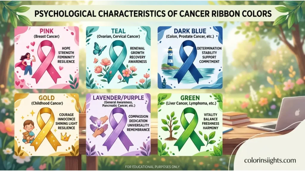
Psychological Characteristics of Cancer Ribbon Colors
Color psychology helps explain why certain ribbon colors resonate and mobilize action.
- Emotional associations:
- Pink: empathy, warmth, nurturing.
- Gold: value, courage, preciousness.
- Teal: clarity, vigilance, calm determination.
- Orange: enthusiasm, urgency, energy.
- Purple: dignity, remembrance, transformation.
- Blue (light/dark): trust, stability, sincerity.
- Green: hope, healing, regeneration.
- Grey/Black: seriousness, memorial, contemplation.
- White/Pearl: purity, clarity, renewal.
- Psychological effects:
- Warm hues (pink, orange, gold) increase perceived approachability and drive participation.
- Cool hues (blue, teal, green) enhance credibility and reflective engagement.
- Neutrals (grey, black, white) focus attention on message gravity and remembrance.
- Positive emotional responses:
- Motivation to donate or walk/run.
- Feelings of solidarity and collective efficacy.
- Comfort for patients and families through visible support.
- Negative emotional responses:
- Overstimulation (bright orange/gold) in sensitive settings.
- Sadness or heaviness (black/grey) when coping is fragile.
- Skepticism if colors feel commercialized or tokenistic.
- Impact on mood and behavior:
- Action priming: Orange and yellow can prompt event sign-ups.
- Trust priming: Blues often improve receptivity to screening messages.
- Reflection/memorial: Purples, blacks, and greys support somber remembrance.
- Typical reactions:
- Quick recognition of pink for breast cancer.
- Growing recognition of gold (childhood) and teal (ovarian).
- Lavender/purple often read as “all-cancer” or survivor support.
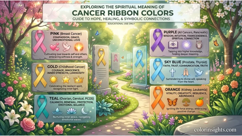
Spiritual Meaning of Cancer Ribbon Colors
Across traditions, these colors carry spiritual and symbolic layers that align with advocacy.
- Holiness: White/pearl suggest sanctity of life and breath; purple can denote sacred dignity.
- Wisdom: Blue/purple align with discernment and thoughtful decision-making.
- Purity: White reflects cleansing, new starts after treatment, or remission.
- Transformation: Purple and green symbolize change, rebirth, and healing journeys.
- Healing: Green and teal evoke restorative energy, balance, and protection.
- Protection: Gold connotes safeguarding children; black can symbolize protective mourning rites.
- Power: Bold orange and deep blue signal strength and resolve.
- Enlightenment: Lavender/purple connect to insight, community awareness, and awakening.
- New beginnings: Yellow and white correlate with hope, dawn, and remission milestones.
- Eternity: Black and pearl can signify memory enduring beyond loss.
Bullet cues by color:
- White/Pearl: purity, breath, renewal, spiritual clarity.
- Pink: compassion, caretaking, heart-centered solidarity.
- Gold: precious life, divine protection of children.
- Teal: intuition, inner knowing, watchfulness.
- Purple: dignity, transfiguration, communal remembrance.
- Blue: truth, faithfulness, calm endurance.
- Green: life force, balance, healing.
- Black: solemnity, eternal remembrance.
- Grey: contemplation, humility, perseverance.
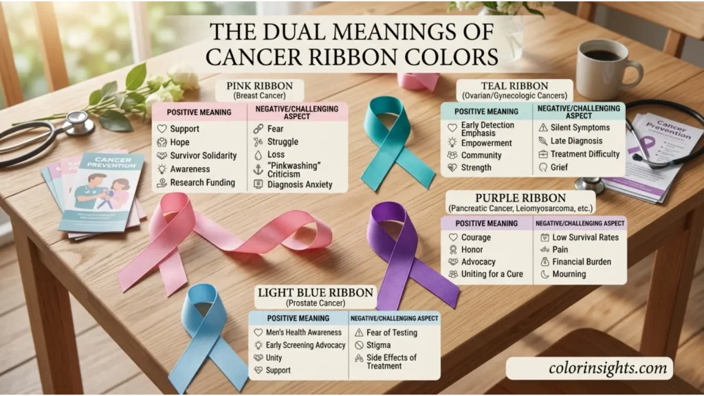
Positive and Negative Meanings of Cancer Ribbon Colors
Positive Meanings
- Purity (white/pearl): White lung-cancer ribbons on discharge day symbolize a fresh chapter.
- Peace (light blue): Prostate-cancer support groups use light blue backdrops to create calm.
- Simplicity (grey): Minimalist grey brain-cancer pins keep focus on stories and research needs.
- Clarity (teal): Ovarian awareness cards use teal to emphasize clear symptom education.
- Freshness (green): Liver-cancer events incorporate green to represent organ healing and renewal.
- Hope (yellow/gold): Childhood-cancer campaigns with gold balloons convey uplift and bravery.
- Balance (blue/green): Colorectal (dark blue) messages blend with green accents to signal prevention and wellness.
- Harmony (lavender): All-cancer vigils use lavender to unite diverse journeys.
Negative Meanings
- Emptiness (grey): Overuse of grey in hospital corridors can feel emotionally flat; add accent colors to soften.
- Isolation (black): Solely black melanoma materials may feel distancing; pairing with white can humanize.
- Coldness (blue): Excessively cool palettes for patient onboarding can seem impersonal; introduce warm neutrals.
- Sterility (white): All-white displays risk clinical detachment; include personal photos or stories.
- Boredom (beige/washed tones): Low-contrast ribbons may be overlooked; increase saturation for visibility.
- Emotional distance (dark neutrals): Somber-only campaigns can depress turnout; add hopeful notes (gold/yellow).
- Perfectionism (crisp white/pink): Highly polished branding may alienate those in active treatment; balance with authentic imagery.
Meanings of Cancer Ribbon Colors
Meanings shift with context—fundraising versus remembrance, pediatric versus adult care, screening education versus memorial. Design decisions (saturation, contrast, and combinations) modulate the message: bright orange signals “act now,” while muted purple invites reflection. Cultural associations also steer interpretation; for example, white may read as mourning in some East Asian contexts, altering tone.
Feng Shui
- Associated element:
- Green/teal: Wood (growth, healing).
- Red/orange/pink: Fire (visibility, passion).
- White/grey: Metal (clarity, precision).
- Blue: Water (flow, wisdom).
- Yellow/gold: Earth (stability, nurturing).
- Energy symbolism:
- Wood nurtures recovery; Fire amplifies awareness; Metal clarifies messaging; Water supports adaptability; Earth grounds community.
- Best rooms:
- Green/blue in recovery or quiet rooms.
- Gold/yellow in gathering or donor spaces for warmth.
- White in information hubs for clarity, softened with natural textures.
- Recommended color combinations:
- Teal + white for clean education materials.
- Purple + gold for dignified galas.
- Dark blue + green for prevention and wellness clinics.
- Home decorating tips:
- Use accent ribbons or art clusters rather than overwhelming single-color walls.
- Balance cool awareness hues with warm woods and textiles for comfort.
Marketing
- Branding psychology:
- Pink brands empathy and community care.
- Blue signals trust and reliability for screening initiatives.
- Gold conveys value and urgency for pediatric research.
- Consumer perception:
- Clear color–cause pairing improves recognition, donation intent, and recall.
- Authenticity matters; consistency across touchpoints prevents confusion.
- Trust signals:
- Dark blue and teal palettes increase perceived credibility and data seriousness.
- Transparent use of funds and survivor stories paired with brand colors deepen trust.
- Product packaging:
- Limited-edition products use the relevant ribbon color with clear donation callouts.
- High contrast improves shelf visibility (e.g., gold on navy for childhood cancer drives).
- Advertising applications:
- Orange for action-oriented campaigns (runs, drives).
- Purple/lavender for memorial months and storytelling.
- Example associations: Pink dominates Breast Cancer Awareness Month campaigns; dark blue appears widely in colorectal awareness; gold is central in September for Childhood Cancer Awareness.
Design
- Interior design:
- Healing spaces benefit from greens, teals, and gentle blues with natural light.
- Purpose-specific accent walls (teal education corner; purple remembrance alcove).
- Graphic design:
- Maintain WCAG contrast for accessibility; pair light ribbon hues with dark type.
- Use ribbon icons sparingly; lead with people-first photography.
- Web design:
- Color-coding cancer types improves navigation (e.g., teal = ovarian section).
- Include an accessible “high contrast” toggle; avoid meaning-by-color alone.
- User experience:
- Warm call-to-action buttons for sign-ups/donations (orange/gold) with clear hierarchy.
- Blue/teal for informational trust zones (risk tools, screening info).
- Minimalist aesthetics:
- Neutral base (white/grey) with a single ribbon color accent keeps focus on content and impact.
Fashion
- Clothing symbolism:
- Wearing a ribbon pin or scarf color signals affiliation, remembrance, or advocacy.
- Event teams often choose monochrome looks with the ribbon hue as the hero accent.
- Seasonal use:
- Brights (orange, yellow, pink) in spring/summer events increase visibility outdoors.
- Deeper tones (purple, dark blue, black) suit autumn memorials and galas.
- Styling effects:
- Teal and dark blue read polished and credible on stage presenters.
- Gold accents elevate formal fundraisers; pink softens and invites approach.
- Personality impressions:
- Pink: approachable, caring.
- Teal: thoughtful, vigilant.
- Gold: bold, values-driven.
- Dark blue: dependable, informed.
- Advantages and disadvantages:
- Pros: Instantly recognizable signaling; conversation starters; unity in groups.
- Cons: Color overlap can confuse; very bright tones may clash with formalwear.
- Practical examples:
- 5K run teams in grey tees with high-contrast brain-cancer graphics for legibility.
- Gala attire in black with gold ribbons for childhood-cancer fundraising.
Color Associations Are Not Universal
- Western cultures:
- Pink strongly linked to breast cancer; purple to remembrance and survivorship; black to mourning; blue to trust and medicine.
- Eastern cultures:
- White often denotes mourning and funerals; red may symbolize life/joy, making white-heavy designs feel somber and red-heavy designs celebratory.
- Religious traditions:
- Purple signifies penitence or royalty in Christian contexts; green is life and renewal in many traditions; gold symbolizes sacred value.
- Historical interpretations:
- Yellow ribbons in the U.S. historically signaled remembrance and safe return; modern campaigns adapt this legacy for hope and support.
- Modern global interpretations:
- Social media accelerates standardization (pink = breast cancer), but local nonprofits may choose alternatives for cultural sensitivity or visibility.
What Cancer Ribbon Colors Say About Your Personality
People drawn to a specific awareness ribbon color sometimes share broad, non-diagnostic tendencies:
- Strengths:
- Pink: empathy, community-building.
- Teal: discernment, calm advocacy.
- Gold: courage, protectiveness, conviction.
- Dark blue: reliability, evidence-mindedness.
- Purple: depth, dignity, resilience.
- Green: optimism, restorative focus.
- Weaknesses:
- Pink: overextending emotionally.
- Teal: overcautiousness or analysis paralysis.
- Gold: intensity that feels demanding.
- Dark blue: rigidity or formality.
- Purple: tendency toward solemnity.
- Green: idealism that outpaces logistics.
- Social behavior:
- Pink/gold: outgoing organizers and fundraisers.
- Teal/blue: educators, detail-oriented supporters.
- Work style:
- Blue/teal: process-driven, data-literate.
- Purple/gold: mission-driven, event-focused.
- Relationships:
- Pink/green: nurturing, steady support.
- Black/grey preference may indicate honoring boundaries and reflective coping.
- Emotional tendencies:
- Warm colors: expressive and action-oriented.
- Cool colors: measured and contemplative.
Important:
Color preferences do not determine personality; they can reflect current roles, experiences, or cultural cues.
FAQs
- What defines cancer ribbon colors?
- Cancer ribbon colors are standardized hues used by advocacy groups to represent specific cancers and related causes, helping people identify, support, and mobilize around them.
- What does the pink cancer ribbon symbolize?
- Pink symbolizes breast cancer awareness, compassion, survivorship, and community action.
- Why are cancer ribbon colors important?
- Colors create instant recognition, unify supporters, aid fundraising, and communicate complex messages simply across media.
- Is gold a warm or cool color, and what does it mean?
- Gold is a warm color representing childhood cancer, preciousness of life, courage, and protective advocacy.
- What emotions do teal and dark blue represent in cancer awareness?
- Teal conveys vigilance, clarity, and calm determination; dark blue signals trust, stability, and credible information.
- What is the spiritual meaning of purple in cancer ribbons?
- Purple often represents dignity, remembrance, transformation, and communal support, used for pancreatic cancer and general survivorship.
- Which colors pair well for awareness design?
- Teal + white for clarity.
- Purple + gold for dignified events.
- Dark blue + green for prevention and wellness. Ensure sufficient contrast for accessibility.
- What does liking pink say about a person?
- Often associated with empathy, warmth, and a community-building mindset—though preferences are not definitive personality measures.
- What ribbon color is used for “all cancers”?
- Lavender is commonly used to represent all cancers and unite diverse advocacy efforts.
- Is white or pearl used for lung cancer?
- Many groups use white or pearl for lung cancer; verify with the relevant organization for consistency.
- What color represents childhood cancer?
- Gold represents childhood cancer, emphasizing the precious value of children’s lives and the need for research.
Conclusion:
Cancer ribbon colors are a powerful visual language that blends symbolism, psychology, spirituality, and culture to advance awareness, compassion, and action.
While pink, gold, teal, purple, dark blue, and others carry recognizable meanings, effectiveness depends on thoughtful, culturally aware design and clear messaging.
Used well, color can comfort patients, mobilize communities, and keep research and prevention at the forefront—turning simple hues into catalysts for real-world impact.


 Welcome to The colorinsiights.com