Color meanings in design play an important role in how people experience visual information, interpret messages, and respond emotionally to different environments. Designers use colors to communicate ideas, establish brand identities, influence consumer perceptions, and create attractive visual experiences.
Each color carries different psychological, cultural, and symbolic associations that can affect how audiences understand a design. From website interfaces and product packaging to interior decoration and fashion, color choices influence both appearance and functionality.
Quick Answer:
Color meanings in design explain how different colors communicate emotions, create visual balance, influence behavior, and strengthen the message behind a design.
What Does Color Symbolize in Design?
Color symbolizes emotions, ideas, values, and messages through visual communication. Designers use different colors to guide attention, establish moods, and help audiences understand the purpose of a product, space, or brand.
Although color associations vary between individuals and cultures, certain patterns appear frequently in modern design.
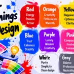
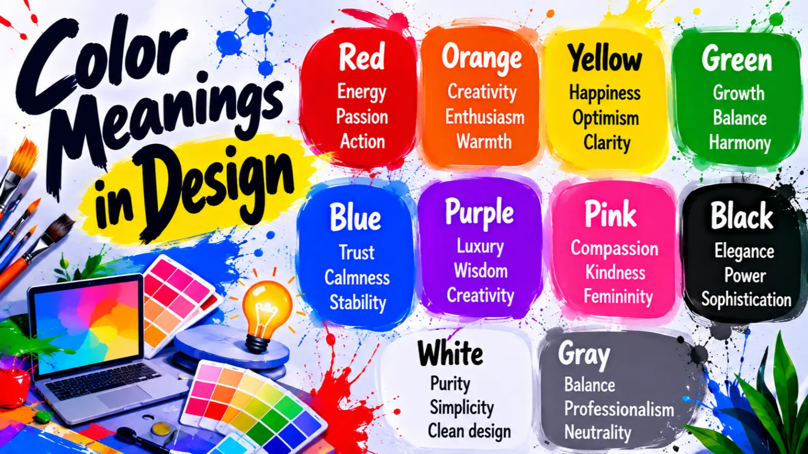
Here are some common color meanings in design:
- Red: Passion, energy, urgency, excitement, and confidence.
- Blue: Trust, stability, professionalism, security, and calmness.
- Yellow: Happiness, optimism, creativity, warmth, and attention.
- Green: Nature, growth, health, balance, and sustainability.
- Purple: Luxury, imagination, spirituality, creativity, and sophistication.
- Orange: Enthusiasm, friendliness, enthusiasm, and adventure.
- Black: Elegance, authority, mystery, sophistication, and strength.
- White: Purity, simplicity, cleanliness, openness, and clarity.
- Gray: Neutrality, professionalism, balance, and practicality.
- Pink: Compassion, romance, kindness, softness, and playfulness.
Color symbolism helps designers create visual identities that communicate specific messages without relying entirely on written language.
Psychological Characteristics of Colors in Design
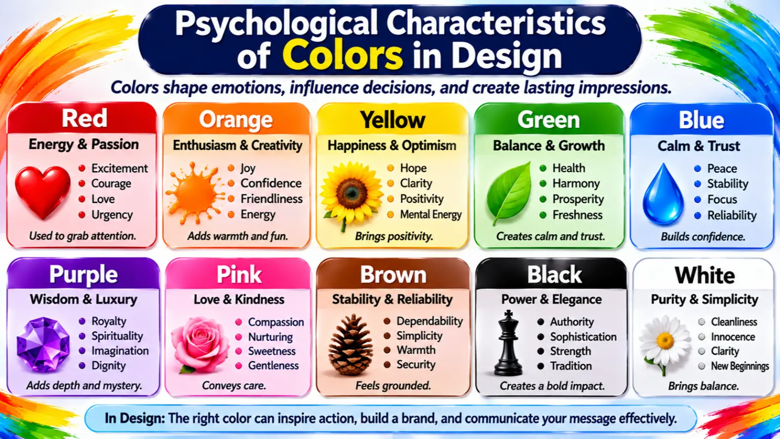
Color psychology examines how colors relate to human emotions, perceptions, and behavior. In design, professionals consider these associations when selecting palettes for websites, advertisements, products, and physical spaces.
However, colors do not produce identical psychological responses in everyone. Personal experiences, cultural backgrounds, lighting, and surrounding visual elements can influence how people interpret them.
Emotional Associations
Different colors commonly create different emotional impressions.
- Red: Creates impressions of excitement, passion, urgency, and intensity.
- Blue: Often communicates calmness, confidence, and reliability.
- Yellow: Suggests happiness, positivity, and mental energy.
- Green: Connects with natural environments, renewal, and balance.
- Purple: Suggests imagination, mystery, and luxury.
- Orange: Communicates warmth, enthusiasm, and friendliness.
- Black: Creates impressions of sophistication, authority, and seriousness.
- White: Suggests simplicity, openness, and cleanliness.
Psychological Effects
Color choices can influence visual attention, perceived temperature, readability, and the overall atmosphere of a design.
For example, bright colors can attract attention, while muted shades often create a more relaxed appearance. Dark backgrounds can produce dramatic visual contrast, whereas lighter backgrounds may make a layout feel more spacious.
Designers also consider color contrast and visual hierarchy to help people identify important information quickly.
Positive Emotional Responses
Colors can communicate several positive emotional qualities:
- Happiness and optimism.
- Confidence and security.
- Creativity and imagination.
- Peace and relaxation.
- Growth and renewal.
- Warmth and friendliness.
- Motivation and enthusiasm.
Negative Emotional Responses
Certain color combinations or excessive color intensity can create unwanted impressions, including:
- Anxiety and overstimulation.
- Emotional distance.
- Aggression and tension.
- Confusion and visual fatigue.
- Coldness and isolation.
- Excessive seriousness.
- Discomfort from poor contrast.
Impact on Mood and Behavior
Color can influence how people experience a physical or digital environment. A soft blue bedroom may feel more relaxing, while a bright orange promotional banner may attract attention.
In commercial environments, designers use color to support product recognition, encourage exploration, and communicate brand personality.
However, color alone cannot guarantee a particular behavior or purchasing decision. Layout, messaging, usability, product quality, and individual preferences also matter.
How People Typically React to Colors
People often associate familiar colors with experiences and established visual conventions.
For example, many audiences recognize green as a sign of success or permission in digital interfaces. Red commonly indicates errors, warnings, or important alerts. Blue frequently appears in professional services because many brands use it to communicate reliability.
These conventions help users understand interfaces more quickly when designers apply them consistently.
Spiritual Meaning of Colors in Design
Colors also carry spiritual and symbolic meanings that designers sometimes incorporate into religious artwork, meditation spaces, wellness branding, and meaningful visual compositions.
Their interpretations depend on religious traditions, cultural backgrounds, and personal beliefs. No universal spiritual meaning applies to every color.
Common spiritual associations include:
- Holiness: White and gold often represent sacredness, divine presence, and spiritual purity.
- Wisdom: Blue, purple, and gold frequently symbolize knowledge, insight, and spiritual understanding.
- Purity: White represents innocence, cleanliness, and spiritual clarity in many traditions.
- Transformation: Purple and violet can symbolize personal growth, change, and spiritual development.
- Healing: Green and blue commonly represent restoration, peace, and renewal.
- Protection: Red, black, and blue carry protective symbolism in various cultural and spiritual traditions.
- Power: Red, gold, and purple often communicate authority, strength, and divine power.
- Enlightenment: White, gold, and violet can represent awareness, illumination, and higher understanding.
- New Beginnings: Green, white, and yellow frequently suggest renewal, hope, and fresh opportunities.
- Eternity: Gold, white, and deep blue can symbolize timelessness, infinity, and spiritual continuity.
Designers can use these associations to create meaningful visual experiences for spiritual organizations, religious publications, and wellness brands.
Positive and Negative Meanings of Colors in Design
Colors can communicate positive or negative messages depending on their intensity, placement, combination, and surrounding context.
Understanding both sides helps designers create balanced and effective visual compositions.
Positive Meanings
Positive color associations can make a design feel welcoming, attractive, and emotionally engaging.
- Purity: White backgrounds communicate cleanliness and simplicity, particularly in healthcare and skincare branding.
- Peace: Soft blue and green shades create calming visual environments in bedrooms and wellness websites.
- Simplicity: Neutral palettes support minimalist layouts and reduce unnecessary visual distractions.
- Clarity: High-contrast combinations make important information easier to recognize.
- Freshness: Light green and aqua communicate freshness in food, beauty, and environmental branding.
- Hope: Yellow and light green can create optimistic and uplifting visual messages.
- Balance: Neutral colors help designers distribute visual weight throughout a composition.
- Harmony: Complementary and analogous color combinations create visually connected designs.
Negative Meanings
Negative color associations often appear when designers use inappropriate combinations or excessive visual intensity.
- Emptiness: Excessive white space without meaningful visual elements can make a design feel unfinished.
- Isolation: Large areas of cool gray or blue may create an emotionally distant atmosphere.
- Coldness: Icy blue and stark white can make an interior feel less welcoming without warm accents.
- Sterility: An entirely white healthcare environment may appear clinical rather than comfortable.
- Boredom: Repetitive neutral palettes can make a website or advertisement feel visually uninteresting.
- Emotional Distance: Dark, muted colors may create a serious or unapproachable impression.
- Perfectionism: Extremely controlled minimalist layouts can communicate rigidity when designers leave little room for visual personality.
These negative interpretations do not mean designers should avoid particular colors. Instead, they should consider how color, contrast, texture, typography, and surrounding elements work together.
Meanings of Colors in Design
Color meanings change according to the design environment, audience, industry, and purpose. A color that communicates excitement in advertising may create an entirely different atmosphere in interior decoration.
Designers consider the following applications when developing effective color palettes.
Feng Shui
In Feng Shui, colors connect with the five elements: Wood, Fire, Earth, Metal, and Water. Each element carries symbolic associations that influence traditional decorating choices.
- Associated Elements: Green connects with Wood, red with Fire, yellow and earthy brown with Earth, white and metallic shades with Metal, and black or deep blue with Water.
- Energy Symbolism: Green represents growth, red symbolizes vitality, yellow suggests stability, white communicates clarity, and black represents depth.
- Best Rooms: Green works well in living spaces, red as an accent in social areas, and soft blue in relaxation spaces.
- Recommended Combinations: Green and brown create an earthy appearance, while white and gold offer a refined combination.
- Home Decorating Tips: Use balanced palettes, natural materials, comfortable lighting, and carefully selected accent colors.
Feng Shui interpretations vary by school and tradition, so designers should treat them as cultural and philosophical approaches rather than scientific rules.
Marketing
Color plays an important role in branding and marketing because it helps businesses establish recognizable visual identities.
Companies select colors that communicate their values, distinguish their products, and create consistent customer experiences.
Branding Psychology
Brands use color to express personality. Blue often communicates reliability, red suggests energy, and green connects with sustainability and natural products.
Consumer Perception
Color influences first impressions and can affect how consumers perceive product quality, affordability, and personality.
Trust Signals
Blue frequently appears in financial services, technology, and healthcare branding because audiences often associate it with security and professionalism.
Product Packaging
Packaging colors help products stand out on shelves. Green packaging often suggests natural ingredients, while black and gold can communicate premium positioning.
Advertising Applications
Marketers use bright colors to attract attention, highlight promotional offers, and establish visual hierarchy. They also select background colors that support readability.
Famous Brands That Use Color Strategically
- Coca-Cola uses red as a recognizable part of its visual identity.
- Facebook has historically used blue prominently in its branding.
- Starbucks uses green in its familiar brand identity.
- McDonald’s combines red and yellow in its branding.
- Chanel frequently uses black and white to communicate timeless elegance.
These examples demonstrate how consistent color choices can strengthen brand recognition.
Design
Color selection is essential across different design disciplines. Designers use palettes to organize information, establish visual hierarchy, and create a consistent experience.
Interior Design
Interior designers use colors to influence the atmosphere of homes, offices, restaurants, and commercial spaces.
- Blue creates a calm bedroom environment.
- Green adds a natural feeling to living rooms.
- Yellow brings warmth to kitchens.
- Beige and white support minimalist interiors.
- Dark gray adds sophistication to offices.
Graphic Design
Graphic designers use color to communicate messages through posters, illustrations, logos, brochures, and advertisements. Contrast helps important information stand out.
Web Design
Website designers select background, text, button, and accent colors to create attractive and readable interfaces.
For example, a white background with dark typography creates a clean appearance, while blue buttons can communicate a professional visual identity.
User Experience (UX)
Color supports navigation and usability. Designers commonly use consistent colors for links, buttons, warnings, success messages, and errors.
Accessibility also matters. Designers should maintain sufficient text contrast and avoid communicating important information through color alone.
Minimalist Aesthetics
Minimalist design often uses white, black, gray, beige, and muted accent colors. These combinations reduce visual clutter and help important elements receive attention.
Fashion
Color meanings in fashion influence personal expression, styling choices, and the visual impression an outfit creates.
Clothing Symbolism
Different colors communicate different fashion identities:
- Black suggests elegance, confidence, and sophistication.
- White represents simplicity and freshness.
- Red communicates passion and boldness.
- Blue suggests professionalism and calmness.
- Green connects with nature and individuality.
- Purple communicates creativity and luxury.
Seasonal Use
Fashion designers frequently use lighter shades in spring and summer collections and deeper shades in fall and winter.
However, modern fashion does not follow strict seasonal color rules.
Styling Effects
Color combinations influence the overall appearance of clothing. Monochromatic outfits create a coordinated look, while complementary colors provide stronger contrast.
Personality Impressions
Bright colors may communicate confidence and creativity, whereas neutral outfits often create a more understated and professional impression.
Advantages and Disadvantages
Advantages:
- Helps communicate individual style.
- Creates visual interest.
- Supports coordinated outfits.
- Makes fashion choices more expressive.
Disadvantages:
- Some combinations may create excessive contrast.
- Certain shades can be difficult to coordinate.
- Cultural expectations may influence how people interpret clothing colors.
- Trends can change the popularity of particular palettes.
Practical Examples
A navy suit with a white shirt creates a professional appearance. A green dress with neutral accessories offers a natural, balanced look. A red jacket can become the focal point of an otherwise simple outfit.
Color Associations Are Not Universal
Color symbolism changes across cultures, religions, historical periods, and social environments. Designers who work with international audiences should consider these differences before selecting a visual identity.
Western Cultures
In many Western societies, white commonly represents weddings, cleanliness, and new beginnings. Black often symbolizes sophistication, authority, or mourning. Red can communicate love, danger, excitement, or urgency.
These associations appear frequently in American advertising, fashion, and visual communication.
Eastern Cultures
In several East Asian traditions, red represents good fortune, celebration, prosperity, and happiness. It frequently appears in Chinese New Year decorations and traditional wedding celebrations.
White can carry associations with mourning in some East Asian cultures, unlike its common wedding symbolism in many Western societies.
Religious Traditions
Religious symbolism also influences color interpretations.
In Christianity, white often represents purity and celebration, while purple frequently connects with penitence and important liturgical seasons.
In Hindu traditions, saffron can symbolize renunciation, spirituality, and sacred knowledge. Green also carries important associations in Islamic artistic and cultural traditions.
Historical Interpretations
Historically, colors often communicated wealth, authority, social position, and religious identity.
Purple became associated with royalty in parts of the ancient world because certain purple dyes required expensive production methods.
Gold represented wealth and divine authority in many historical civilizations. Red frequently appeared in royal clothing, ceremonial decorations, and military symbolism.
Modern Global Interpretations
Modern globalization, digital media, and international branding have influenced how people interpret colors.
For example, green commonly communicates environmental responsibility in international marketing. Blue often appears in technology and corporate branding.
However, international brands should research local traditions and audience expectations instead of assuming that one color communicates the same message everywhere.
What Colors in Design Say About Your Personality
Color preferences can offer clues about personal taste, emotional associations, and creative interests. However, liking a particular color does not scientifically establish someone’s personality.
People may prefer colors because of childhood experiences, cultural influences, fashion trends, or personal memories.
Common personality associations include:
Red Lovers: Often associated with confidence, energy, passion, and a preference for bold visual expression.
Blue Lovers: Commonly associated with reliability, calmness, thoughtfulness, and stability.
Green Lovers: Often connected with nature, balance, growth, and a preference for peaceful environments.
Yellow Lovers: Frequently associated with optimism, creativity, curiosity, and enthusiasm.
Purple Lovers: Commonly linked with imagination, individuality, artistic interests, and luxury.
Black Lovers: Often associated with sophistication, independence, confidence, and understated style.
White Lovers: Frequently connected with simplicity, organization, clarity, and minimalist preferences.
Strengths
People who enjoy particular colors may appreciate the emotions and visual qualities those colors communicate. For example, someone who prefers green may enjoy natural environments, while someone who prefers bright yellow may appreciate cheerful surroundings.
Weaknesses
Strong color preferences can sometimes lead people to avoid unfamiliar palettes or rely too heavily on particular visual styles. However, these tendencies do not apply to everyone.
Social Behavior
Color choices can influence how people express themselves socially. Bright clothing may attract attention, while neutral outfits may communicate a reserved appearance.
Work Style
Some people prefer calm office environments with neutral colors, while others enjoy energetic surroundings with bright accents. These choices reflect individual preferences rather than proven personality categories.
Relationships
People may use colors to express affection, confidence, comfort, or personal identity. However, relationship behavior depends on much more than color preference.
Emotional Tendencies
Favorite colors can reflect emotional associations and personal experiences. A person may choose blue because it reminds them of the ocean or green because it connects them with nature.
Ultimately, color preferences provide interesting insights into visual taste, but they cannot determine character, intelligence, emotional stability, or relationship compatibility.
Frequently Asked Questions
1. What defines color meanings in design?
Color meanings in design refer to the emotions, ideas, and symbolic messages that people associate with different colors. Designers use these associations to communicate brand identity, create visual harmony, and improve user experiences.
2. What do colors symbolize in design?
Colors symbolize different qualities. Red commonly represents passion and energy, blue suggests trust and stability, green communicates growth, yellow represents optimism, and black often symbolizes sophistication.
3. Why are colors important in design?
Colors help establish visual hierarchy, attract attention, improve recognition, and communicate messages. They also influence how audiences experience websites, products, advertisements, and physical environments.
4. Are colors warm or cool in design?
Colors generally fall into warm and cool categories. Red, orange, and yellow are warm colors, while blue, green, and violet usually fall into the cool category. Some colors, such as green and purple, can shift depending on their undertones.
5. What emotions do colors represent?
Colors can represent happiness, excitement, confidence, peace, creativity, and sophistication. Their emotional associations depend on individual experiences, cultural backgrounds, and visual context.
6. What is the spiritual meaning of colors in design?
Spiritual color meanings depend on cultural and religious traditions. White may symbolize purity, purple can represent wisdom, green often connects with renewal, and gold frequently communicates divine power or enlightenment.
7. What colors work well together in design?
Popular combinations include:
- Blue and white for a clean, professional appearance.
- Green and beige for a natural aesthetic.
- Black and gold for luxury branding.
- Red and white for strong visual contrast.
- Purple and silver for a modern, sophisticated appearance.
- Yellow and gray for a balanced combination of warmth and neutrality.
8. What does liking certain colors say about a person?
A person’s favorite color may reflect visual preferences, personal experiences, and emotional associations. However, color preferences alone cannot reliably determine personality traits.
9. How do designers choose the right color palette?
Designers consider brand identity, target audience, cultural expectations, accessibility, readability, and the emotional message they want to communicate. They also test colors in their intended environment.
10. How does color influence branding?
Color helps businesses establish recognizable identities and communicate brand personalities. Consistent color palettes can improve brand recognition and create a more cohesive customer experience.
11. Why is color contrast important in graphic and web design?
Color contrast helps distinguish text, backgrounds, buttons, and other interface elements. Strong contrast improves readability and supports accessibility, especially for people with visual impairments.
12. Can color choices influence consumer behavior?
Color choices can influence attention, product impressions, and emotional responses. However, purchasing decisions also depend on price, product quality, brand reputation, messaging, and individual needs.
Conclusion
Color meanings in design extend beyond visual appearance. They influence emotional impressions, brand recognition, communication, and the overall experience of digital and physical environments. From interior decoration and fashion to marketing and website development, thoughtful color selection helps designers communicate ideas effectively. Understanding color psychology, cultural symbolism, and visual hierarchy allows designers to create meaningful and accessible compositions. Although color associations are not universal, a carefully planned palette can strengthen a design’s identity, improve usability, and create a more memorable experience.