Outlook Scheduling Assistant color meanings are primarily functional rather than symbolic. Microsoft Outlook uses color, shading, patterns, and status indicators to help users understand whether meeting attendees are available, busy, tentative, out of the office, or outside their working hours.
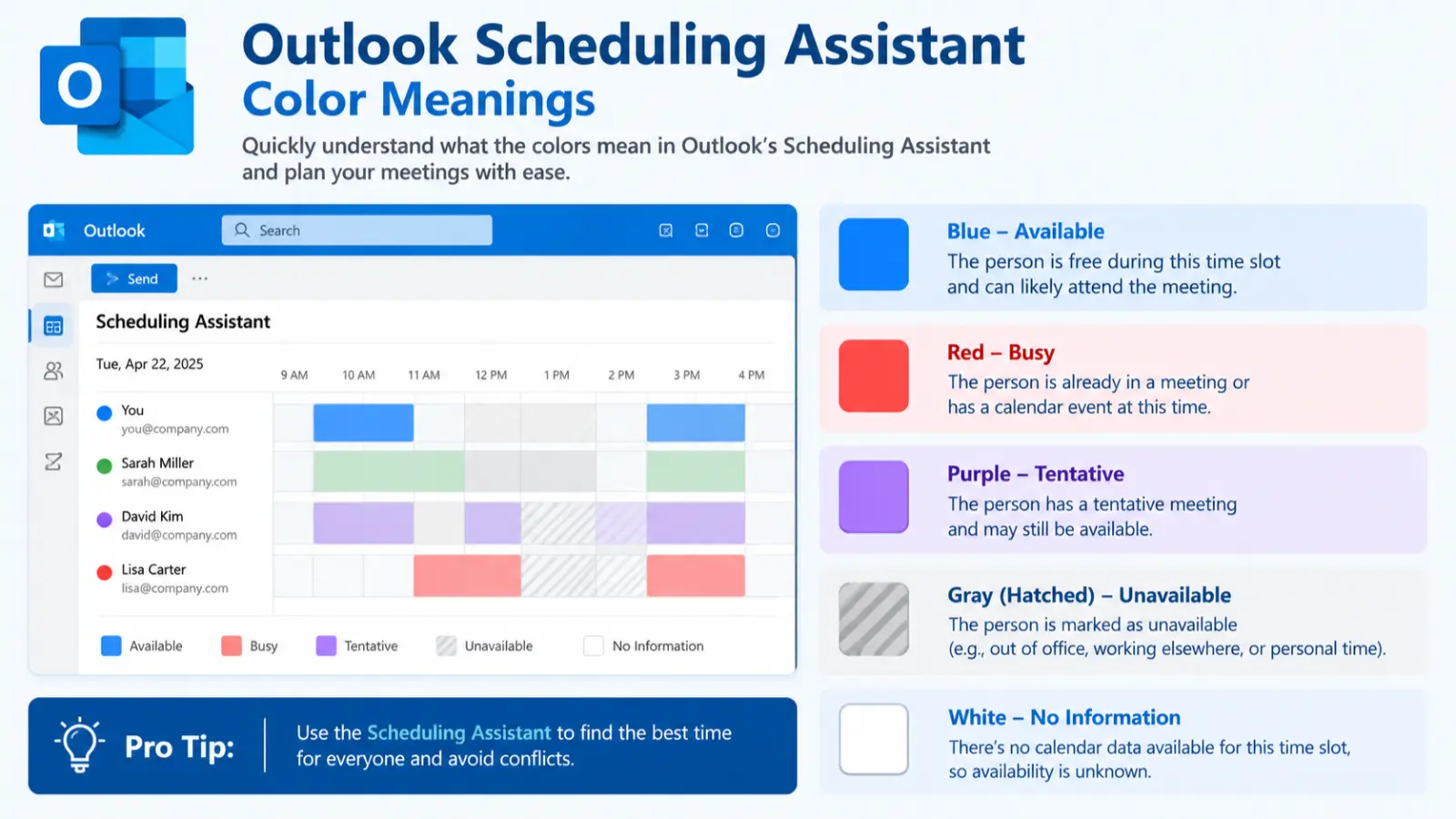
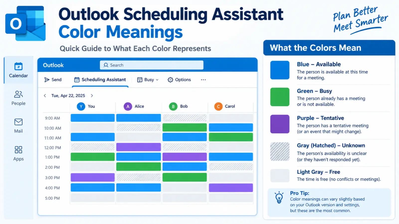
In the standard Scheduling Assistant, dark blue represents busy time, light-blue hashing represents tentative appointments, and light gray indicates time outside an attendee’s working hours. (Microsoft Support) Other Outlook scheduling views may use different colors—for example, Microsoft documents green for available, red for busy, purple for Out of Office, and gray for unknown in Scheduling Poll. (Microsoft Support)
Quick answer:
Outlook’s scheduling colors should be interpreted as availability and calendar-status signals, not as personality, spiritual, or emotional color symbolism.
What Do Outlook Scheduling Assistant Colors Symbolize?
Unlike traditional color psychology, the colors in Outlook Scheduling Assistant have a practical user-interface purpose. They communicate scheduling information at a glance so that an organizer can identify potential conflicts and find a suitable meeting time.
The exact appearance can vary depending on the Outlook version, platform, and scheduling feature being used. Microsoft currently documents several related systems, including Scheduling Assistant, Scheduling Poll, the Outlook calendar, and Teams presence indicators. (Microsoft Support)
Core Scheduling Assistant colors
| Outlook color or pattern | Meaning | What it tells the organizer |
|---|---|---|
| Dark blue | Busy | The attendee has time marked as unavailable |
| Light-blue hashed pattern | Tentative | The attendee has a tentative appointment |
| Light gray | Outside working hours | The period falls outside the attendee’s defined working schedule |
| Blue selected-time bar | Selected meeting period | The organizer’s currently selected meeting time |
| Green | Available in certain scheduling views | The attendee/time is available |
| Red | Busy in certain scheduling views | The attendee is unavailable |
| Purple | Out of Office in certain scheduling views | The attendee is marked unavailable because they are out of the office |
| Gray | Unknown in certain scheduling views | Availability information is unavailable or unknown |
Microsoft specifically states that in the standard Scheduling Assistant, busy periods appear dark blue, tentative appointments use a light-blue hashed block, and periods outside working hours appear light gray. (Microsoft Support)
In Scheduling Poll, Microsoft documents a different visual legend: green indicates available, red indicates busy, purple indicates Out of Office, and gray indicates unknown. (Microsoft Support)
Therefore, the same color should not automatically be assigned the same meaning throughout every Outlook screen.
Psychological Characteristics of Outlook Scheduling Assistant Colors
Color psychology traditionally examines how colors can influence perception, emotion, attention, and behavior. However, Outlook’s scheduling colors should not be interpreted as psychological tests or personality indicators.
The most useful psychological principle here is visual information processing. Color allows people to recognize patterns faster than reading every calendar entry individually.
Emotional associations
The interface colors can produce practical visual associations:
- Blue can feel organized, familiar, and informational.
- Gray often communicates neutrality or reduced emphasis.
- Green is commonly associated with availability or a positive state in digital interfaces.
- Red commonly attracts attention and can signal conflict, interruption, or an unavailable state.
- Purple can distinguish a special status such as Out of Office from ordinary busy time.
These associations are influenced by common interface conventions. They should not be confused with a universal psychological meaning.
Psychological effects
Outlook’s color coding can reduce the amount of information a person needs to consciously read.
For example, an organizer can visually scan a row and recognize:
- a period of conflict,
- a possible meeting window,
- a tentative commitment,
- or time outside normal working hours.
This is an example of visual encoding: information is represented through visual properties such as color, pattern, and position.
Positive emotional responses
In scheduling interfaces, users may experience:
- Greater clarity
- Reduced cognitive effort
- A stronger sense of organization
- Faster recognition of available periods
- Greater confidence when comparing schedules
Negative emotional responses
Dense calendars can also create:
- Visual overload
- Stress from seeing many conflicts
- Difficulty distinguishing similar shades
- Confusion when different Outlook features use different legends
- Frustration when availability information is incomplete
Impact on mood and behavior
The practical purpose of Outlook’s color system is to influence navigation and decision-making, not mood in the traditional color-psychology sense.
A clear visual distinction between available and unavailable time can encourage users to compare meeting options quickly. Conversely, a calendar filled with conflict indicators may make scheduling appear more difficult.
How people typically react to the colors
Most users learn the colors through repeated exposure to Outlook rather than through formal knowledge of color psychology. The surrounding labels, patterns, icons, and calendar context are therefore important.
For accessibility, users should not rely on color alone. Microsoft combines color with patterns, labels, icons, and other interface information in different parts of Outlook.
Spiritual Meaning of Outlook Scheduling Assistant Colors
The colors used in Outlook Scheduling Assistant do not have an official spiritual or religious meaning. They are interface conventions designed to communicate scheduling status.
It would therefore be misleading to claim that Outlook’s dark blue means spiritual wisdom, purple means transformation, or gray means spiritual isolation.
Nevertheless, if the colors are discussed from a general cultural color-symbolism perspective, separate from Microsoft’s software definitions, broader associations may exist.
- Blue: Often associated in general color symbolism with calmness, trust, depth, and contemplation.
- Gray: Often associated with neutrality, balance, restraint, and ambiguity.
- Green: Frequently associated with growth, renewal, nature, and harmony.
- Red: Commonly associated with energy, urgency, passion, danger, or attention.
- Purple: Historically associated in some cultures with royalty, dignity, spirituality, or transformation.
These are cultural associations rather than meanings assigned by Outlook.
Holiness
No Outlook Scheduling Assistant color officially represents holiness.
Wisdom
Blue and purple can be associated with wisdom in some cultural and artistic traditions, but that symbolism does not determine their Outlook function.
Purity
White is sometimes associated with purity in cultural symbolism, but white is not the principal availability indicator in the Scheduling Assistant legend.
Transformation
Purple may carry transformation-related symbolism in some spiritual traditions, but in Outlook it can represent Out of Office in certain scheduling views. (Microsoft Support)
Healing
Green is sometimes associated with healing and renewal in broader symbolism, while Outlook may use green to indicate availability in Scheduling Poll.
Protection
No Outlook scheduling color officially represents protection.
Power
Red and purple can carry associations with power in particular cultural contexts, but those meanings should not be transferred to Outlook’s interface.
Enlightenment
Blue, white, and gold can carry enlightenment-related associations in various traditions, but these are unrelated to Outlook’s scheduling logic.
New beginnings
Green can symbolize renewal in general color symbolism. In Outlook scheduling interfaces, however, green can simply indicate that a participant is available.
Eternity
Blue can symbolize infinity or eternity in some artistic and cultural contexts, but Outlook does not use blue to communicate such a concept.
Positive and Negative Meanings of Outlook Scheduling Assistant Colors
Positive Meanings
The functional benefits of Outlook’s color system include:
Clarity
Color helps users quickly distinguish different availability states without opening every calendar entry.
Example: A meeting organizer can scan several attendee rows to locate periods without dark-blue conflicts.
Organization
Consistent visual indicators help transform complicated schedules into recognizable patterns.
Example: A manager comparing five calendars can identify overlapping availability more efficiently than by reading every appointment title.
Simplicity
Color reduces the amount of textual information needed to communicate a scheduling condition.
Example: A small colored block can communicate “busy” without requiring the word to appear inside every time slot.
Freshness and availability
Green, where used to represent availability, can create an immediately recognizable positive status in scheduling interfaces.
Example: Scheduling Poll uses green to identify an available participant. (Microsoft Support)
Balance
Gray can visually de-emphasize periods that are outside working hours or whose availability is unknown, depending on the Outlook feature.
Harmony
A well-organized calendar allows multiple schedules to be viewed together, helping users identify periods when commitments can coexist without conflicts.
Negative Meanings
The colors can also communicate potential scheduling problems.
Emptiness
Gray areas may visually appear less active than colored calendar periods. However, gray does not universally mean “empty” in Outlook.
Isolation
A period outside working hours can appear visually separated from ordinary scheduling time.
Coldness
Blue and gray may sometimes feel visually cool or neutral, but this is an aesthetic response, not an Outlook status definition.
Sterility
Minimal gray-and-blue interfaces can sometimes appear clinical or highly utilitarian. This is a design perception rather than an intended scheduling message.
Boredom
Repeated neutral colors can feel visually monotonous in a large calendar.
Emotional distance
A highly structured scheduling interface can feel impersonal because its purpose is to represent availability rather than human relationships.
Perfectionism
Users may become overly focused on finding a completely conflict-free meeting period. Outlook itself does not associate its colors with perfectionism; this is a possible behavioral response to highly structured scheduling.
Meanings of Outlook Scheduling Assistant Colors
The meaning of an Outlook color depends heavily on where the color appears.
Scheduling Assistant
Microsoft’s standard Scheduling Assistant uses:
- Dark blue: Busy
- Light-blue hashing: Tentative
- Light gray: Outside working hours
The selected meeting period is also visually marked, and Outlook displays attendee availability beneath their names. (Microsoft Support)
Scheduling Poll
Scheduling Poll uses a different legend:
- Green: Available
- Red: Busy
- Purple: Out of Office
- Gray: Unknown
This distinction is important for SEO searches such as “Outlook scheduling assistant red meaning” because users may actually be looking at Scheduling Poll or another Outlook scheduling interface. (Microsoft Support)
Outlook Calendar status
Outlook supports several “Show As” states, including:
- Free
- Working Elsewhere
- Tentative
- Busy
- Out of Office
Microsoft notes that calendar items can be assigned these availability states. (Microsoft Support)
Out of Office
Out of Office has particular importance because it communicates more than an ordinary scheduling conflict.
Microsoft explains that Out of Office items appear purple in classic Outlook, while Busy items use a blue color theme. Both indicate that the person should not be expected to be available, but Out of Office provides a different reason for the unavailability. (Microsoft Support)
Feng Shui
Feng Shui is not part of Microsoft’s Outlook design system, so Feng Shui interpretations should be kept separate from Outlook’s technical color meanings.
Associated element
In traditional Feng Shui, colors are sometimes associated with the five elements:
- Blue and black: Water
- Green: Wood
- Red: Fire
- White and gray: Metal
- Yellow, beige, and earthy tones: Earth
These associations belong to Feng Shui traditions, not Microsoft Outlook.
Energy symbolism
From a Feng Shui perspective, blue may be connected with calm or Water energy, green with growth and Wood energy, and red with Fire energy.
Best rooms
For general home design, these interpretations are sometimes applied to:
- Blue: bedrooms or quiet spaces
- Green: living areas or spaces associated with growth
- Gray/white: offices and modern spaces
- Red: areas where energetic accents are desired
Recommended color combinations
Common combinations include:
- Blue + white
- Blue + gray
- Green + neutral tones
- Red + white
- Purple + gray
Home decorating tips
Use these associations as design concepts rather than scientific rules. A small accent color can provide visual interest without overwhelming a room.
Marketing
Outlook’s scheduling colors are not primarily marketing colors, but the broader psychology of these colors is relevant to software interface design.
Branding psychology
Blue is widely used in technology and business branding because it can communicate qualities such as reliability, professionalism, and stability.
Consumer perception
Green can suggest availability, progress, or positive status in digital products, while red can attract attention to conflicts or warnings.
Trust signals
Blue is frequently used in corporate and technology interfaces because users often associate it with professionalism and familiarity.
Product packaging
The same broad color associations can influence packaging:
- Blue may communicate reliability.
- Green may communicate naturalness or freshness.
- Red may emphasize energy or urgency.
- Purple may suggest premium or distinctive positioning.
- Gray may communicate sophistication or neutrality.
Advertising applications
Digital advertising often uses contrast strategically. A strong accent color can draw attention to a button, warning, offer, or important piece of information.
However, color associations are influenced by context, culture, industry, saturation, typography, and surrounding colors.
Design
Interior design
Blue, gray, green, red, and purple can each establish different visual atmospheres in an interior.
Blue-gray combinations often create a restrained professional appearance, while green can introduce a more natural feeling.
Graphic design
Graphic designers use hue, saturation, brightness, contrast, and color hierarchy to guide attention.
For example, a red element against a mostly neutral layout can become an immediate focal point.
Web design
Web interfaces often use:
- Green for positive states
- Red for errors or conflicts
- Blue for information or primary interface elements
- Gray for secondary or inactive information
- Purple for special categories or distinctive states
Outlook demonstrates how color can become part of a broader visual language.
User experience
Good UX design should make status information understandable without forcing users to interpret color alone.
This is especially important for people with color-vision differences.
Minimalist aesthetics
Blue, gray, white, and restrained accent colors work well in minimalist interfaces because they create hierarchy without excessive visual noise.
Fashion
The Outlook-specific meaning of a color should not be transferred to clothing. Fashion uses color primarily for aesthetic, cultural, social, and symbolic purposes.
Clothing symbolism
- Blue can create a professional or calm impression.
- Gray can communicate neutrality and sophistication.
- Green can suggest naturalness or freshness.
- Red can appear energetic and attention-grabbing.
- Purple can appear expressive or distinctive.
Seasonal use
Color trends vary, but blue, gray, and muted tones are commonly used in professional wardrobes throughout the year.
Green, red, and purple can function as seasonal accent colors depending on fashion trends.
Styling effects
Dark colors can visually reduce emphasis, while brighter or more saturated colors tend to attract attention.
Personality impressions
A person wearing blue may be perceived as conventional or professional, while a person wearing red may attract greater visual attention. These are impressions, not reliable measurements of personality.
Advantages and disadvantages
Blue
- Advantage: Professional and versatile
- Disadvantage: Can appear conventional
Gray
- Advantage: Neutral and easy to coordinate
- Disadvantage: Can appear subdued
Green
- Advantage: Fresh and natural
- Disadvantage: Some shades are difficult to coordinate
Red
- Advantage: High visual impact
- Disadvantage: Can dominate an outfit
Purple
- Advantage: Distinctive and expressive
- Disadvantage: Some shades are harder to use in conservative settings
Color Associations Are Not Universal
Color meaning changes across cultures, industries, historical periods, and situations. This principle is especially important when comparing traditional color symbolism with Outlook’s interface colors.
Western cultures
In many Western contexts, blue is frequently associated with professionalism, trust, calmness, and corporate communication. Red can indicate urgency or danger, while green commonly communicates positive status or permission.
These conventions also appear frequently in digital interfaces.
Eastern cultures
Color symbolism varies substantially across Asian cultures. For example, red has traditionally held positive associations in many Chinese cultural contexts, including celebration and good fortune, while white can have different associations from those common in many Western settings.
Consequently, a color cannot be assigned one universal psychological meaning.
Religious traditions
Religious traditions often assign symbolic meanings to colors. Purple, white, red, blue, green, and gold may have different roles depending on the tradition and ritual context.
These meanings are independent of Outlook’s scheduling system.
Historical interpretations
Color symbolism has changed throughout history because pigments, dyes, political institutions, religious practices, trade, and social class influenced how colors were perceived.
Purple, for example, was historically associated with prestige in some societies because certain purple dyes were difficult and expensive to produce.
Modern global interpretations
Modern technology has created widely recognized interface conventions. Green often suggests an available or successful state, while red often highlights a problem or conflict.
However, these conventions are not completely universal, and Outlook’s own documentation shows that the meaning of a color depends on the specific scheduling feature being viewed.
What Outlook Scheduling Assistant Colors Say About Your Personality
The colors shown in another person’s Outlook calendar cannot reliably tell you their personality.
A person who frequently sees or uses blue, green, red, purple, or gray in Outlook is not necessarily calm, energetic, creative, introverted, organized, or stressed. The colors primarily represent calendar states determined by meetings, appointments, working hours, and availability settings.
Strengths
If a person prefers a highly color-coded calendar, it may reflect a preference for visual organization, but it does not prove a specific personality trait.
Weaknesses
Overinterpreting calendar colors can lead to inaccurate assumptions about another person’s behavior or character.
Social behavior
A busy calendar does not necessarily mean someone is highly social, while an open calendar does not necessarily indicate isolation.
Work style
A calendar containing many meetings does not prove that someone is collaborative, managerial, or less productive. Meeting schedules reflect organizational requirements as well as individual choices.
Relationships
Outlook colors should not be used to infer how someone feels about coworkers, friends, or family.
Emotional tendencies
A red conflict indicator does not mean that the person is angry, while a green availability indicator does not prove that they are happy or enthusiastic.
The safest interpretation is the functional one: Outlook colors communicate scheduling status, not personality.
Frequently Asked Questions
1. What defines Outlook Scheduling Assistant color meanings?
Outlook Scheduling Assistant colors are visual indicators used to communicate attendee availability and scheduling conditions. Microsoft documents dark blue for busy time, light-blue hashing for tentative appointments, and light gray for time outside working hours in the standard Scheduling Assistant. (Microsoft Support)
2. What does the color blue mean in Outlook Scheduling Assistant?
In the standard Scheduling Assistant, dark blue represents busy time. Microsoft also uses blue to visually identify the selected meeting-time area in current Outlook scheduling interfaces. (Microsoft Support)
3. What does light blue mean in Outlook Scheduling Assistant?
A light-blue hashed block represents a tentative appointment in the standard Scheduling Assistant. (Microsoft Support)
4. What does gray mean in Outlook Scheduling Assistant?
Light gray can indicate time outside an attendee’s working hours in the standard Scheduling Assistant. In Scheduling Poll, gray can instead indicate that availability is unknown. (Microsoft Support)
5. What does green mean in Outlook scheduling?
In Scheduling Poll, green indicates available. Microsoft also uses green to indicate that everyone is available in certain mobile Scheduling Assistant experiences. (Microsoft Support)
6. What does red mean in Outlook Scheduling Assistant?
In Scheduling Poll, red indicates busy. However, red is not the same as the dark-blue busy indicator documented for the standard Scheduling Assistant, so the exact Outlook feature matters. (Microsoft Support)
7. What does purple mean in Outlook scheduling?
Purple can represent Out of Office in Scheduling Poll and in certain Outlook calendar displays. Microsoft explains that classic Outlook uses purple for Out of Office items and a blue theme for Busy items. (Microsoft Support)
8. Is Outlook Scheduling Assistant color psychology?
Not primarily. Outlook uses color as a functional user-interface coding system. Although users may have emotional or psychological reactions to colors, Microsoft defines the colors according to scheduling status rather than personality or psychological symbolism.
9. What emotions do Outlook Scheduling Assistant colors represent?
They do not officially represent emotions. Blue, green, red, purple, and gray communicate scheduling information such as busy, available, Out of Office, tentative, or unknown depending on the Outlook feature.
10. What does Outlook color coding mean for productivity?
Color coding can make schedules easier to scan and can reduce the amount of text a user must process. It helps organizers identify conflicts and compare attendee availability more quickly.
11. Can Outlook colors tell you someone’s personality?
No. Calendar colors represent scheduling states rather than personality traits. A busy calendar does not prove that someone is ambitious or stressed, and an available period does not prove that someone is relaxed or unproductive.
12. Why do Outlook colors sometimes seem different?
Microsoft has several related scheduling experiences, including the standard Scheduling Assistant, Scheduling Poll, Outlook Calendar, and Teams presence. Their visual legends are not identical. Always interpret a color according to the specific Outlook screen you are viewing. (Microsoft Support)
Conclusion
Outlook Scheduling Assistant color meanings are best understood as a practical visual language for calendar availability rather than as traditional color symbolism. In the standard Scheduling Assistant, dark blue indicates busy time, light-blue hashing indicates tentative appointments, and light gray represents time outside an attendee’s working hours. (Microsoft Support) Other Outlook scheduling tools use additional conventions: Scheduling Poll, for example, uses green for available, red for busy, purple for Out of Office, and gray for unknown. (Microsoft Support) Understanding these distinctions helps users interpret schedules accurately, avoid meeting conflicts, and choose times that work for multiple participants. For psychological, spiritual, cultural, marketing, fashion, and design interpretations, the colors can be discussed separately—but those broader meanings should never be mistaken for Microsoft’s official Outlook status definitions.