Color meanings in Japan reflect centuries of cultural traditions, religious beliefs, seasonal celebrations, literature, clothing, and artistic expression. Japanese colors often communicate ideas beyond their visual appearance, connecting nature with emotions, spirituality, social customs, and national identity.
Red may symbolize protection and celebration, white can represent purity and mourning, and black may suggest formality, mystery, or elegance. These meanings change depending on the occasion, historical period, and combination of colors. Understanding Japanese color symbolism provides valuable insight into traditional art, kimono design, architecture, branding, and modern Japanese culture.
Quick answer:
Japanese colors symbolize protection, purity, prosperity, nature, renewal, and respect, with meanings that depend on cultural context.
What Do Colors Symbolize in Japan?
Japanese color symbolism, often discussed through the concept of iro (色), reflects the relationship between visual appearance, cultural tradition, and social meaning. Historically, colors appeared in court clothing, religious ceremonies, paintings, seasonal celebrations, and everyday objects. Some colors also became associated with rank and status under historical clothing regulations.
Japan’s color traditions developed through interactions among indigenous beliefs, Buddhism, Chinese cultural influences, court traditions, and local customs. Consequently, a single color may carry several meanings rather than one fixed interpretation.
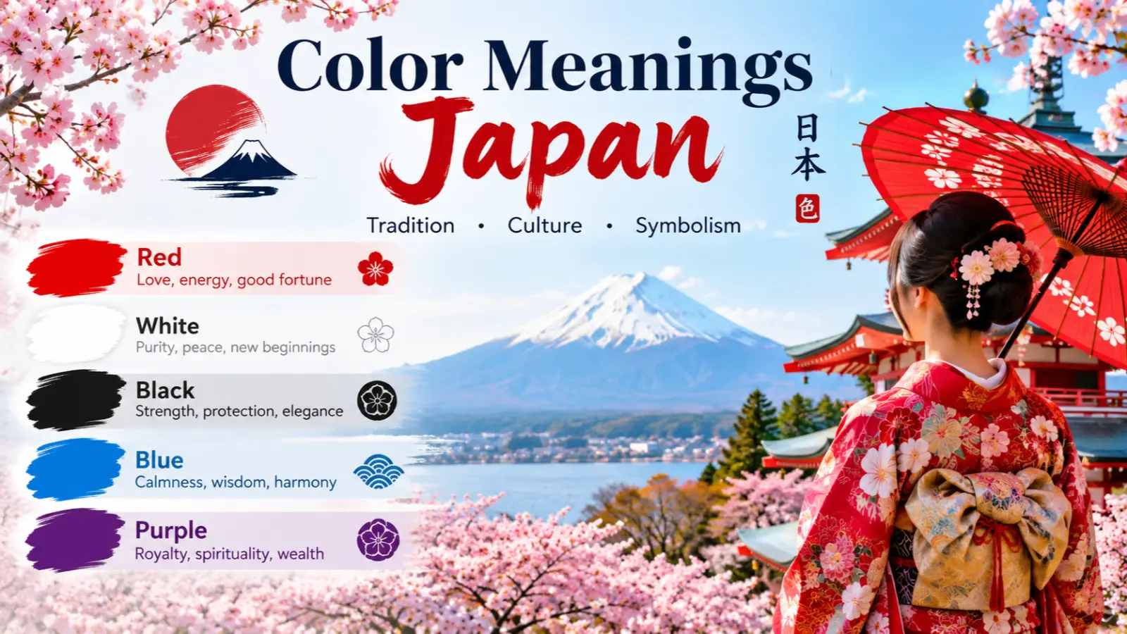
Common Japanese color associations include:
- Red (aka, 赤): Protection, celebration, vitality, and good fortune.
- White (shiro, 白): Purity, sacredness, simplicity, and mourning in certain contexts.
- Black (kuro, 黒): Formality, sophistication, seriousness, and mystery.
- Blue (ao, 青): Calmness, nature, reliability, and freshness.
- Green (midori, 緑): Vegetation, renewal, balance, and life.
- Yellow (kiiro, 黄色): Brightness, energy, sunlight, and attention.
- Purple (murasaki, 紫): Nobility, refinement, and historical prestige.
- Pink (pinku, ピンク): Springtime, cherry blossoms, tenderness, and affection.
- Gold (kin, 金): Wealth, celebration, prestige, and sacred decoration.
- Gray (haiiro, 灰色): Restraint, subtlety, neutrality, and understated elegance.
These are broad associations rather than universal rules. A color’s significance depends on the object, occasion, combination, and community interpreting it.
Psychological Characteristics of Japanese Colors
Color psychology examines how colors influence perception, attention, emotional associations, and behavior. In Japan, these responses interact with cultural learning, traditional imagery, and familiar seasonal references.
There is no single psychological response shared by all Japanese people. Individual preferences, age, experience, and context can change how a color is perceived.
Emotional Associations
Japanese color traditions provide familiar associations that can shape modern emotional responses.
- Red: Often evokes energy, celebration, warmth, and protection.
- White: Can communicate cleanliness, simplicity, and solemnity.
- Black: May suggest elegance, authority, formality, or grief.
- Blue: Often feels calm, dependable, or refreshing.
- Green: Connects visually with plants, forests, and renewal.
- Yellow: Can attract attention and suggest brightness or optimism.
- Purple: May communicate refinement, dignity, and luxury.
- Pink: Commonly evokes cherry blossoms, spring, romance, and gentleness.
Psychological Effects
Color influences visual attention and interpretation, but its effects depend on the setting. A red torii gate at a Shinto shrine, for example, carries cultural associations that go beyond red’s general visual intensity.
Similarly, the white of a wedding kimono may communicate ceremonial purity, while white clothing at a funeral can reflect a different tradition. Understanding the occasion is essential to interpreting the color correctly.
Positive Emotional Responses
Japanese colors can evoke positive associations such as:
- Hope: Pink cherry blossoms suggest the arrival of spring.
- Purity: White can communicate cleanliness and ceremonial significance.
- Protection: Red appears in some religious and folk contexts associated with warding off misfortune.
- Peace: Blue and green can evoke water, vegetation, and calm landscapes.
- Prosperity: Gold is frequently associated with wealth and celebration.
- Harmony: Subtle combinations in traditional Japanese design can create visual balance.
Negative Emotional Responses
Colors can also communicate less positive emotions.
- Mourning: White and black may appear in Japanese funeral traditions.
- Danger: Bright red can signal warnings or urgent information.
- Grief: Black is commonly associated with formal mourning attire.
- Coldness: Certain blue-gray palettes can feel distant or austere.
- Excess: Overusing gold or intense colors may make a design appear overwhelming.
- Ambiguity: A color may be misunderstood when its traditional context is unfamiliar to an audience.
Impact on Mood and Behavior
Japanese designers often use restrained palettes, natural materials, and seasonal color combinations to establish a particular atmosphere. Soft pinks and pale greens can evoke spring, while deep reds and gold can create a festive appearance.
These associations can influence how people interpret a visual message, but color alone does not reliably determine behavior, mood, or purchasing decisions.
How People Typically React to Japanese Colors
Familiar cultural references can make Japanese color combinations especially meaningful. People may recognize pink as a cherry blossom reference, red as a festive or protective color, or black as formal and sophisticated.
International audiences may interpret the same colors differently because their cultural experiences differ. Clear imagery and contextual information help communicate the intended meaning.
Spiritual Meaning of Japanese Colors
The spiritual meaning of Japanese colors is shaped by Shinto, Buddhism, ceremonial practices, and local traditions. These belief systems overlap in Japanese history, but they do not assign one universal spiritual meaning to every color.
The following interpretations describe common associations rather than a single religious color code.
- Holiness: White is strongly associated with ritual purity in many Shinto contexts. White paper streamers called shide are used in shrine settings and certain ritual objects.
- Wisdom: Purple may suggest refinement and intellectual prestige because of its historical association with high status and court culture.
- Purity: White clothing and white ritual materials can signify purification and ceremonial cleanliness.
- Transformation: Seasonal colors, especially cherry-blossom pink and autumn red, can express change and the passage of time.
- Healing: Red has protective associations in some folk traditions, including the use of red objects intended to ward off misfortune. These traditions should not be confused with medically proven healing effects.
- Protection: Red is associated with protection in some Japanese religious and folk contexts. Red shrine architecture and red amulets may be interpreted within their specific traditions.
- Power: Purple historically communicated high rank and prestige in particular Japanese court and clothing traditions.
- Enlightenment: Gold appears in Buddhist imagery and temple decoration, where it can communicate sacred radiance, dignity, and spiritual importance.
- New beginnings: White, pink, and green can evoke renewal through spring festivals, new growth, and seasonal change.
- Eternity: Gold and enduring natural motifs may suggest continuity in religious art, although eternity is not the exclusive meaning of any one Japanese color.
Spiritual interpretations should be understood in their specific settings. A shrine, Buddhist temple, wedding ceremony, and funeral may use colors differently, even when the same shade appears in each.
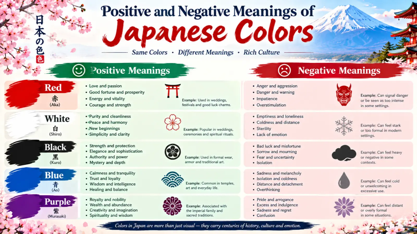
Positive and Negative Meanings of Japanese Colors
Positive Meanings
Japanese color symbolism offers numerous positive associations, especially when colors appear in traditional celebrations, nature, and religious settings.
1. Purity and simplicity
White often communicates cleanliness, ritual purity, and simplicity. It also plays a prominent role in traditional Japanese aesthetics.
Example: White clothing may appear in Shinto ceremonies, while white space in Japanese-inspired graphic design can create a calm, uncluttered composition.
2. Peace and harmony
Blue and green can evoke water, gardens, and natural landscapes. Their use may create a sense of visual balance.
Example: A Japanese-style interior might combine muted green textiles with natural wood and soft blue accents to establish a peaceful atmosphere.
3. Freshness and renewal
Green and pink are closely associated with spring and new growth.
Example: Cherry blossom decorations and pale green packaging can suggest freshness for seasonal products.
4. Hope and celebration
Red and gold frequently appear in celebratory decorations and auspicious designs.
Example: Red-and-gold envelopes used for certain monetary gifts can communicate congratulations and good wishes.
5. Balance and refinement
Muted colors such as gray, beige, indigo, and subdued green can create a refined visual effect.
Example: Traditional textiles may combine several understated shades to create richness without excessive brightness.
6. Prosperity and good fortune
Gold and red often appear in festive contexts.
Example: New Year decorations may use auspicious colors and motifs to express hopes for happiness and prosperity.
Negative Meanings
The negative meanings of Japanese colors depend on context and should not be generalized to every situation.
1. Mourning and loss
White and black both appear in Japanese funeral traditions, although their uses differ.
Example: White garments have historical associations with funerary practices, while black formal clothing is commonly worn at contemporary funerals.
2. Danger and warning
Red can signal danger or urgency in modern public communication.
Example: Red signs and warning labels attract attention because of their contrast and familiar visual conventions.
3. Coldness and emotional distance
Blue-gray palettes may feel austere when used without warm materials or contrasting colors.
Example: A room dominated by cool gray and blue may appear less inviting than one balanced with wood and warm lighting.
4. Excess and ostentation
Gold can communicate wealth, but too much may appear visually overwhelming.
Example: A package covered entirely in reflective gold may look less restrained than one using gold as a small accent.
5. Visual monotony
A palette made entirely of neutral colors may feel dull if it lacks contrast, texture, or variation.
Example: A website using only gray and beige may struggle to direct attention toward important information.
6. Cultural misunderstanding
Colors can lose their intended meaning when separated from familiar traditions.
Example: An international advertisement using white to communicate celebration may not account for audiences who associate white with mourning.
These examples demonstrate why color symbolism should be interpreted alongside cultural knowledge and visual context.
Meanings of Japanese Colors
Japanese color meanings change according to the setting in which they appear. A red shrine gate, a red gift envelope, and a red warning sign use the same broad color family but communicate different messages.
Historical period also matters. Court clothing, samurai garments, religious objects, modern streetwear, and commercial packaging belong to different cultural contexts. Some colors were influenced by laws governing clothing and rank, while others became familiar through religious practices or seasonal imagery.
Understanding these differences is important for anyone using Japanese colors in art, interior design, marketing, fashion, or education.
Feng Shui
Feng Shui is a Chinese system of spatial arrangement and traditional symbolism, not a Japanese color system. Japanese-inspired interiors can nevertheless incorporate Feng Shui principles as a separate design approach.
- Associated element: In common Feng Shui systems, red relates to Fire, blue and black to Water, green to Wood, and yellow or earthy brown to Earth.
- Energy symbolism: These colors traditionally represent different types of energy and balance.
- Best rooms: Soft greens can suit living spaces, while muted blues may work in bedrooms or studies.
- Color combinations: Try indigo with cream, green with natural wood, or red with restrained gold accents.
- Decorating tips: Use natural materials, simple arrangements, and a limited palette to create a calm Japanese-inspired space.
These are traditional design interpretations, not scientific guarantees or specifically Japanese religious rules.
Marketing
Japanese colors are widely used in branding because they can communicate freshness, tradition, sophistication, and celebration.
Branding psychology: Red can create strong visual recognition, blue may suggest reliability, and green can communicate nature or environmental themes. Gold can introduce a premium appearance.
Consumer perception: Color influences initial impressions, but product quality, messaging, reputation, and customer experience also shape trust.
Trust signals: Consistent visual identity, readable packaging, accurate product information, and credible claims provide stronger trust signals than color alone.
Product packaging: White and pastel shades often suit skincare and lifestyle products, while green can support natural-product branding. Red and gold may be appropriate for festive packaging.
Advertising applications: Seasonal campaigns frequently use pink for cherry blossom season, red and gold for celebratory promotions, and indigo for traditional or heritage-inspired products.
Famous Japanese brands use distinctive color identities. <Entity value=”Nintendo” category=”brand” disambig=”Japanese video game and entertainment company”/> is widely recognized for red branding, while <Entity value=”Uniqlo” category=”brand” disambig=”Japanese casual clothing retailer”/> uses red in its logo and retail identity. <Entity value=”Shiseido” category=”brand” disambig=”Japanese beauty and cosmetics company”/> has used red in important elements of its branding. These examples demonstrate contemporary brand strategy rather than fixed traditional symbolism.
Design
Japanese color meanings influence many contemporary design applications, especially those inspired by traditional art, nature, and minimalist aesthetics.
- Interior design: Combine natural wood, cream, charcoal, indigo, and muted green for a calm Japanese-inspired interior.
- Graphic design: Use red for emphasis, white space for clarity, and restrained palettes for visual hierarchy.
- Web design: Indigo and neutral shades can create a polished interface, while red can highlight important actions.
- User experience: Maintain sufficient contrast, consistent color meanings, and accessible text. Never use color as the only way to communicate information.
- Minimalist aesthetics: Neutral shades and subtle contrasts can emphasize shape, texture, and negative space.
Traditional Japanese art also includes rich color combinations, so Japanese design should not be reduced to minimalism alone. Ukiyo-e prints, festival decorations, and elaborate textiles demonstrate a wide range of color intensity and complexity.
Fashion
Japanese fashion draws on historical clothing traditions, regional textiles, contemporary streetwear, and international fashion trends.
Clothing symbolism: White can communicate ceremony and simplicity, black may suggest formality, indigo evokes traditional textiles, and red can provide a bold accent.
Seasonal use: Pink is popular in spring-inspired styling, while deeper reds, browns, and golds can suit autumn and winter palettes.
Styling effects: Indigo denim, neutral layers, and carefully placed color accents can create a balanced look. Bright red accessories can add contrast to a restrained outfit.
Personality impressions: Muted colors may suggest understated styling, while vivid colors can create a more expressive appearance. These impressions do not establish personality.
Advantages: Japanese-inspired palettes offer versatility, strong contrasts, and opportunities to combine tradition with modern styling.
Disadvantages: Using too many saturated shades can make an outfit visually busy, while an overly neutral palette may feel flat without differences in texture.
Practical example: Pair an indigo jacket with cream trousers and a muted green accessory for an understated Japanese-inspired outfit. For a festive look, introduce red or gold as an accent rather than allowing both colors to dominate.
Japanese fashion is diverse, and no single palette represents all Japanese clothing or personal style.
Color Associations Are Not Universal
Color meanings differ across societies, religious traditions, historical periods, and individual experiences. Japanese symbolism is distinctive in some respects, but its meanings have also developed through cultural exchange.
Western cultures: In many contemporary Western settings, white is associated with weddings, purity, and cleanliness, while black often signifies formality or mourning. These associations overlap with some Japanese uses but do not apply identically to every occasion.
Eastern cultures: East Asia contains diverse color traditions. In Japan, red can be associated with celebration and protection, while in China it is strongly linked with good fortune and festive occasions. Although these traditions have historical connections, their meanings are not interchangeable.
Religious traditions: Shinto uses white in ritual purification and includes red in certain shrine settings. Buddhism uses gold in sacred imagery and temple decoration. These practices should be interpreted within each tradition rather than treated as one unified Japanese spiritual color code.
Historical interpretations: Japanese court culture used color and clothing regulations to express rank and status. Purple held particular prestige in certain historical periods. Indigo dyeing also became important in Japanese textiles, while seasonal colors appeared in poetry, clothing, and art.
Modern global interpretations: International advertising, anime, fashion, and digital media have spread Japanese color imagery around the world. Cherry blossom pink is widely recognized as a springtime symbol, while red-and-white combinations appear in festive and national contexts. Nevertheless, audiences may interpret these colors through their own cultural expectations.
Recognizing these differences helps avoid oversimplifying Japanese traditions or assuming that a color has one meaning everywhere.
What Japanese Colors Say About Your Personality
People who prefer Japanese color palettes may appreciate nature, seasonal imagery, traditional art, minimalist interiors, or expressive fashion. However, choosing a particular color does not provide a scientifically reliable personality assessment.
Broad color associations can help describe visual preferences, but they cannot establish an individual’s character, emotional health, or behavior.
- Strengths: People who favor balanced palettes may appreciate visual harmony, while those drawn to vivid colors may enjoy expressive design.
- Weaknesses: A strong preference for one palette may sometimes limit experimentation, but it does not indicate a personal flaw.
- Social behavior: Someone interested in Japanese color traditions may enjoy art, cultural history, fashion, or design. This interest does not establish introversion or extroversion.
- Work style: A preference for restrained colors may reflect aesthetic taste, not necessarily organization or attention to detail.
- Relationships: Color preferences cannot determine empathy, loyalty, compatibility, or communication skills.
- Emotional tendencies: People may find particular colors calming, exciting, or meaningful because of personal memories and cultural associations.
Color preference is one part of individual taste. Personal experience, upbringing, social environment, and values offer a more complete picture of personality.
Frequently Asked Questions
1. What defines Japanese color meanings?
Japanese color meanings are the cultural and symbolic associations connected with colors in Japanese history, religion, seasonal traditions, art, fashion, and everyday life. Their interpretation depends on the setting.
2. What does red symbolize in Japan?
Red can represent protection, vitality, celebration, and good fortune in certain Japanese contexts. It appears in shrine architecture, festive decorations, and some traditional objects.
3. What does white mean in Japanese culture?
White is associated with purity, ritual cleanliness, and simplicity in many contexts. It also has historical connections with mourning and funerary practices, showing that its meaning changes by occasion.
4. Why are colors important in Japan?
Colors communicate seasonal changes, ceremonial significance, social formality, and visual identity. They appear in traditional clothing, religious settings, festivals, art, and contemporary branding.
5. Are Japanese colors warm or cool?
Japanese color palettes include both warm and cool colors. Red, pink, and gold are generally warm, while blue and indigo are cool. Green and gray vary according to their undertones.
6. What emotions do Japanese colors represent?
Red may evoke energy or celebration, white can suggest purity, blue may communicate calmness, and green can evoke nature. Emotional responses differ among individuals and settings.
7. What do Japanese colors mean spiritually?
White is associated with ritual purity in many Shinto contexts, while gold appears in Buddhist sacred imagery. Red can have protective associations in some traditions. None of these meanings applies universally to every situation.
8. What colors pair well in Japanese design?
Indigo and cream create a classic contrast, green and natural wood evoke nature, and red with restrained gold can feel festive. Gray, beige, and charcoal offer subtle combinations for contemporary interiors.
9. What does liking Japanese colors say about a person?
It may indicate an appreciation for Japanese art, seasonal imagery, nature-inspired design, or particular fashion aesthetics. It does not reliably determine personality traits.
10. Are Japanese color meanings the same as Chinese color meanings?
No. Japanese and Chinese traditions have influenced one another historically, but they developed distinct customs, religious practices, and artistic conventions. Similar colors can have different meanings across the two cultures.
Conclusion
Color meanings in Japan reveal a rich relationship between nature, spirituality, history, social customs, and visual expression. Red can communicate protection or celebration, white may signify purity or mourning, purple has historical associations with prestige, and pink evokes the beauty and transience of cherry blossoms. These meanings are not universal rules; they depend on the occasion, historical period, and cultural context. From traditional clothing and religious ceremonies to modern branding, interior design, and fashion, Japanese color symbolism offers valuable insight into how colors communicate identity and emotion. Understanding the history behind each association helps readers appreciate Japanese culture with greater accuracy and respect.