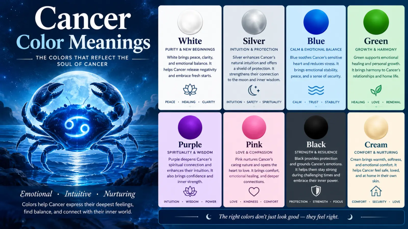
Cancer color meanings are closely connected with awareness, solidarity, remembrance, hope, and support. Unlike some symbols that have one universally accepted color, cancer awareness uses many ribbon colors because different cancer types have developed their own visual identities. Lavender is commonly used to represent all cancers collectively, while colors such as pink, teal, gold, orange, light blue, purple, and white identify particular cancer communities. (Medical News Today)
From a color-psychology perspective, lavender combines the calm qualities associated with lighter purple with symbolic ideas of compassion, reflection, dignity, and hope. Its meaning can change according to cultural context, design, organization, and the specific cancer being represented.
Quick answer: The general cancer awareness color is lavender, symbolizing broad cancer awareness, compassion, solidarity, hope, remembrance, and support. However, there is no single color for every cancer type.
What Does the Color Lavender Symbolize?
Lavender is a soft tint of purple created by adding white to purple. In color symbolism, it is often associated with qualities such as calmness, gentleness, spirituality, reflection, dignity, and sensitivity.
In the context of cancer awareness, lavender has a more specific symbolic function. It can represent people affected by cancer across different diagnoses rather than focusing on one particular type. Medical and cancer-awareness references commonly identify lavender as a general color for all cancers. (Medical News Today)
The broader cancer color meaning can therefore include:
- Awareness: Drawing public attention to cancer.
- Solidarity: Showing support for patients, survivors, caregivers, and families.
- Hope: Expressing optimism and encouragement without implying a guaranteed medical outcome.
- Compassion: Communicating empathy toward people affected by cancer.
- Remembrance: Honoring people who have died from cancer.
- Unity: Bringing different cancer communities together.
- Dignity: Creating a respectful visual symbol for a serious subject.
- Visibility: Helping organizations communicate an important cause through a recognizable color.
Lavender should not be interpreted as a medical treatment color. Its primary function is symbolic and communicative.
It is also important to distinguish general cancer awareness from cancer-specific awareness. For example, pink is strongly associated with breast cancer, teal with ovarian cancer, gold with childhood cancer, light blue with prostate cancer, and purple with pancreatic cancer in commonly used U.S. awareness systems. (Medical News Today)
Psychological Characteristics of the Color Lavender
Emotional Associations
Lavender is generally perceived as a softer and less intense version of purple. Because it contains substantial white, it can appear gentler, quieter, and more delicate than saturated violet or deep purple.
Common psychological associations include:
- Calmness
- Gentleness
- Reflection
- Compassion
- Sensitivity
- Creativity
- Spirituality
- Serenity
- Nostalgia
- Emotional openness
Color psychology should be interpreted carefully. People’s responses to color are influenced by personal experience, culture, context, lighting, saturation, and individual preference. There is no universal psychological response that every person has to lavender.
Psychological Effects
In visual communication, lavender can create a relatively soft and approachable impression. Compared with highly saturated reds or oranges, pale lavender often produces a less visually aggressive effect.
It can be useful when a designer wants to communicate:
- Calm rather than urgency
- Compassion rather than confrontation
- Reflection rather than stimulation
- Support rather than competition
- Elegance rather than heaviness
For cancer-awareness campaigns, these qualities can help create communication that feels respectful and emotionally considerate.
Positive Emotional Responses
Lavender may evoke:
- Comfort
- Hope
- Peacefulness
- Tenderness
- Compassion
- Emotional reassurance
- Reflection
- Grace
- Optimism
These associations make lavender particularly suitable for awareness materials that aim to communicate support and human connection.
Negative Emotional Responses
Lavender can also produce less positive associations depending on context.
Possible responses include:
- Excessive delicacy
- Sentimentality
- Emotional distance
- Passivity
- Nostalgia
- Artificial sweetness
- Weakness when used without stronger contrasting colors
For example, a very pale lavender used alone in a healthcare advertisement may have insufficient visual contrast or urgency. Designers may therefore combine it with darker purple, navy, charcoal, white, or another accent color.
Impact on Mood and Behavior
Color can influence attention, perception, and emotional impressions, but it should not be treated as a deterministic behavioral mechanism.
In practical design, lavender can encourage a slower, more reflective visual experience. It can make a space or interface feel softer and more welcoming.
In cancer-awareness communication, this may help establish an atmosphere of:
- Empathy
- Respect
- Support
- Community
- Remembrance
- Hope
People may also interpret a lavender ribbon as an invitation to acknowledge cancer as a broad social and human issue rather than focusing on one diagnosis.
Spiritual Meaning of the Color Lavender
Lavender has acquired spiritual associations through its relationship with purple, a color historically connected with sacredness, royalty, contemplation, and transcendence in various traditions.
These meanings are symbolic rather than medical claims. Lavender should not be presented as having the power to cure cancer or physically heal disease.
Holiness
Purple-family colors have been associated with sacredness and religious ceremony in several historical traditions. Lavender, as a lighter form of purple, can therefore suggest reverence and respect.
Wisdom
Purple and lavender can symbolize contemplation and inner wisdom. In a cancer-awareness context, this may represent reflection on life experiences, resilience, and lessons learned.
Purity
Because lavender contains a significant amount of white, it can visually communicate cleanliness and simplicity. This is a symbolic association rather than evidence that lavender represents physical purity.
Transformation
Lavender can symbolize transition and personal transformation. In awareness contexts, it may represent the different stages people experience before, during, and after a cancer diagnosis.
Healing
Lavender is sometimes used symbolically to communicate healing, restoration, comfort, and emotional care. This should be understood as emotional or spiritual symbolism, not evidence of a medical healing effect.
Protection
Purple-family colors have historically been associated with dignity and authority. In modern symbolic use, lavender can represent emotional protection, care, and solidarity.
Power
Deep purple is traditionally associated with authority and status. Lavender softens that symbolism, creating a concept of quiet strength rather than dominance.
Enlightenment
Its connection with spirituality and contemplation can make lavender a symbol of awareness, reflection, and expanded understanding.
New Beginnings
A soft purple shade can communicate renewal and transition. In cancer-support materials, this may symbolize moving into a new stage of life.
Eternity
Lavender may also be used metaphorically to express remembrance and enduring connection, particularly when honoring someone who has died.
Positive and Negative Meanings of the Color Lavender
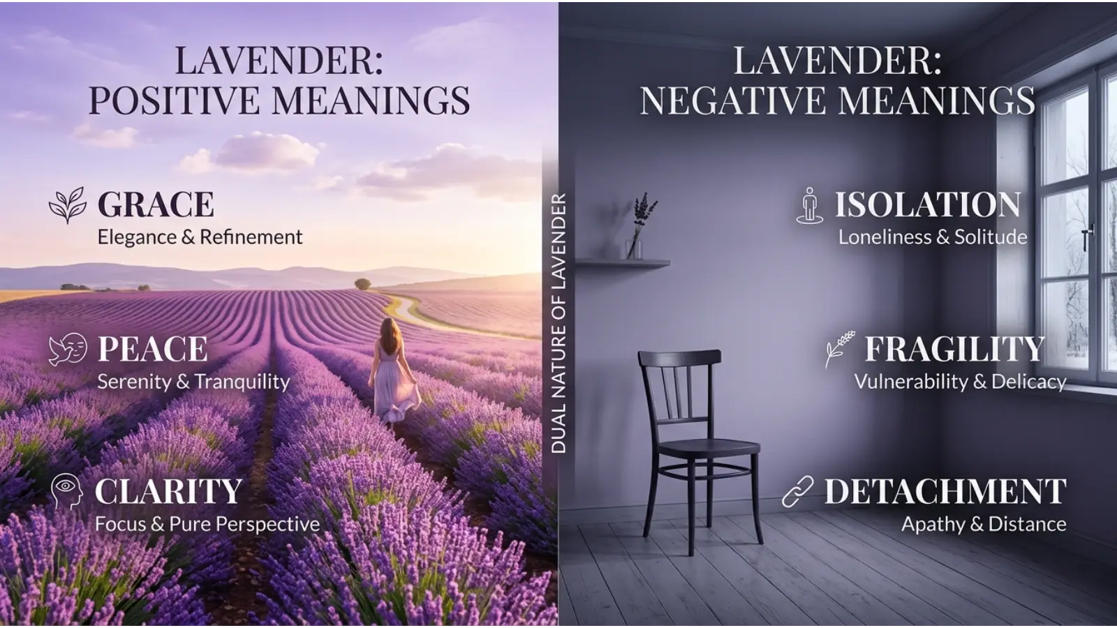
Positive Meanings
Compassion
Lavender can communicate empathy and care.
Real-world example: A cancer-support organization may use lavender in brochures, event graphics, or social-media artwork to create a compassionate visual identity.
Hope
Lavender can symbolize hope and encouragement.
Real-world example: A lavender ribbon displayed during an awareness event can communicate support for people affected by different forms of cancer.
Peace
Its soft appearance makes lavender useful for peaceful and reflective designs.
Real-world example: A hospital support-group room might use muted lavender as an accent color to create a calmer visual environment.
Unity
Lavender’s role as a general cancer-awareness color can represent multiple cancer communities collectively.
Real-world example: A general cancer-awareness campaign may choose lavender instead of a cancer-specific ribbon color.
Dignity
Lavender can appear sophisticated and restrained, making it appropriate for remembrance and memorial communication.
Real-world example: A memorial program may use muted lavender typography or borders to communicate respect.
Freshness
Pale lavender can have a clean, airy quality when paired with white.
Real-world example: A website may use lavender and white to create a modern healthcare aesthetic.
Spiritual Reflection
Lavender can communicate contemplation and inner reflection.
Real-world example: A support organization might use lavender imagery in content focused on remembrance, mindfulness, or emotional support.
Harmony
Lavender generally combines well with neutral colors and other soft tones.
Real-world example: Lavender, white, and gray can form a balanced palette for an awareness brochure.
Negative Meanings
Excessive Sentimentality
Very soft lavender can become overly delicate when used without contrast.
Example: An awareness campaign that relies exclusively on extremely pale lavender may appear decorative rather than conveying the seriousness of its message.
Emotional Distance
Some lavender palettes may feel detached or formal.
Example: A heavily lavender corporate report with minimal human imagery may feel less personal than a warmer design.
Weakness
Very pale shades can sometimes lack visual authority.
Example: Important calls to action may become difficult to notice if they are printed in low-contrast lavender.
Sterility
When lavender is combined with excessive white and clinical gray, it can produce a highly medical or sterile appearance.
Example: A healthcare website using lavender, white, and cool gray throughout may feel clinical rather than emotionally warm.
Boredom
Using one muted shade repeatedly can create visual monotony.
Example: A long webpage with lavender backgrounds, lavender headings, and lavender buttons may lack visual hierarchy.
Perfectionism
Lavender is sometimes associated with refined, polished, and delicate aesthetics. In certain contexts, that can communicate an unrealistic sense of perfection.
Example: An overly polished social-media campaign might unintentionally make the cancer experience appear more controlled or simple than it really is.
Emotional Distance
Cooler lavender shades can appear less intimate than warmer pinks, peaches, or creams.
Example: A remembrance card using only cool lavender may feel more formal than one combining lavender with warm neutrals.
Meanings of the Color Lavender
The meaning of lavender changes substantially according to context. A lavender ribbon, lavender wall, lavender dress, and lavender website button do not necessarily communicate the same message.
In cancer awareness, the color generally functions as a symbol of broad awareness and solidarity. fashion, it can represent softness, creativity, or modern elegance. In interiors, it may create a calm or sophisticated atmosphere. branding, it can communicate compassion, imagination, premium positioning, or wellness.
Context is therefore essential when interpreting lavender color meaning.
Feng Shui
In modern Feng Shui-inspired decorating, purple and its lighter variations are frequently associated with the Fire element, although specific Feng Shui schools can differ in their interpretations.
Associated Element
Lavender is often connected with Fire through its relationship to purple.
Energy Symbolism
It can symbolize:
- Spiritual awareness
- Creativity
- Transformation
- Recognition
- Personal expression
Best Rooms
Lavender can work well in:
- Bedrooms
- Meditation areas
- Reading spaces
- Creative studios
- Quiet sitting areas
Use stronger purple sparingly if the goal is a restful environment.
Recommended Color Combinations
Popular combinations include:
- Lavender + white
- Lavender + cream
- Lavender + soft gray
- Lavender + sage green
- Lavender + natural wood
- Lavender + muted navy
Home Decorating Tips
Use lavender as an accent rather than covering every surface. Lavender cushions, curtains, artwork, bedding, or a single feature wall can introduce color without overwhelming the room.
For a more sophisticated appearance, combine dusty lavender with warm white, beige, wood, or charcoal.
Marketing
Lavender has an increasingly recognizable place in wellness, beauty, lifestyle, and cause-related communication.
Branding Psychology
Lavender can communicate:
- Compassion
- Creativity
- Sophistication
- Wellness
- Sensitivity
- Individuality
- Calmness
For cancer-awareness organizations, lavender can also function as a visual shorthand for general cancer support.
Consumer Perception
Consumers may perceive lavender branding as softer and more emotionally approachable than aggressive or highly saturated color schemes.
However, color alone does not determine consumer behavior. Brand reputation, message clarity, product quality, imagery, typography, and cultural expectations also influence perception.
Trust Signals
Lavender does not inherently prove that a healthcare organization is trustworthy. Trust comes from factors such as:
- Accurate information
- Professional credentials
- Transparent communication
- Evidence-based claims
- Consistent branding
- Privacy and security practices
- Clear organizational identity
Lavender can support a trustworthy visual tone, but it cannot substitute for credible information.
Product Packaging
Lavender packaging is common in:
- Personal-care products
- Beauty products
- Wellness products
- Candles
- Fragrance
- Self-care products
In cancer-related fundraising, lavender may appear on shirts, ribbons, event materials, and promotional merchandise.
Advertising Applications
Lavender can be used in:
- Awareness campaigns
- Social-media graphics
- Fundraising advertisements
- Healthcare communications
- Memorial campaigns
- Support-group materials
- Educational infographics
Cancer organizations should ensure that their color choices clearly distinguish general cancer awareness from awareness of a specific cancer type.
Design
Interior Design
Lavender works particularly well as an accent color. It can soften neutral interiors and create a gentle atmosphere.
For healthcare-related interiors, muted lavender can be paired with warm neutrals to avoid an overly clinical appearance.
Graphic Design
Lavender provides a recognizable visual identity for awareness campaigns. Designers can pair it with dark text to maintain accessibility and readability.
Web Design
Lavender can be used for:
- Hero backgrounds
- Accent panels
- Icons
- Illustrations
- Secondary buttons
- Infographics
- Awareness banners
Text contrast should always be tested rather than assuming that a lavender-and-white combination will be accessible.
User Experience
In UX design, lavender can establish hierarchy through restrained accent use. A designer might use lavender for secondary actions while using a darker neutral for primary navigation or essential information.
Minimalist Aesthetics
Lavender works especially well with minimalist palettes based on:
- White
- Off-white
- Gray
- Charcoal
- Beige
- Natural wood
A small amount of lavender can add personality without compromising a clean visual structure.
Fashion
Clothing Symbolism
Lavender clothing can communicate:
- Softness
- Creativity
- Individuality
- Elegance
- Calmness
- Modern femininity
- Emotional sensitivity
In cancer-awareness events, lavender clothing or accessories can also serve as visible expressions of support.
Seasonal Use
Lavender is especially popular in spring and summer collections, but deeper lavender and muted purple can work throughout the year.
Styling Effects
Lavender can be paired with:
- White for a fresh look
- Beige for understated elegance
- Gray for sophistication
- Navy for contrast
- Black for a stronger appearance
- Sage green for a natural palette
- Denim for casual styling
Personality Impressions
Someone wearing lavender may be perceived as creative, gentle, expressive, refined. These are social impressions rather than scientifically established personality measurements.
Advantages
Lavender clothing can:
- Add color without appearing extremely bold
- Work well with neutrals
- Create a softer visual impression
- Support an awareness-themed outfit
- Provide a distinctive alternative to traditional pink or purple
Disadvantages
Lavender may:
- Appear too delicate for some settings
- Have limited contrast with pale skin tones depending on lighting
- Look overly sweet when paired with too many pastel colors
- Require careful coordination in formal professional clothing
Practical example: For a cancer-awareness walk, a lavender shirt with dark jeans and neutral sneakers can communicate support while remaining casual and practical.
Color Associations Are Not Universal
Color meanings are shaped by history, culture, religion, geography, personal experience, and social conventions. There is no single interpretation of lavender that applies to every society.
Western Cultures
In contemporary Western contexts, purple and lavender are frequently associated with creativity, spirituality, individuality, luxury, and sensitivity.
In cancer awareness, lavender has become a commonly recognized general-purpose color for representing all cancers. (Medical News Today)
At the same time, specific cancer types use their own established colors. Breast cancer is commonly represented by pink, ovarian cancer by teal, childhood cancer by gold, prostate cancer by light blue, and lung cancer by white or pearl. (Medical News Today)
Eastern Cultures
Color symbolism varies substantially across Asian cultures and cannot be reduced to one “Eastern meaning.”
For example, purple has had associations with status, spirituality, and ceremony in different Asian historical contexts. White can symbolize mourning in some East Asian traditions, while red can have strongly positive associations in China.
These differences demonstrate why awareness campaigns intended for international audiences should research local symbolism instead of assuming that Western color psychology applies everywhere.
Religious Traditions
Purple has significant symbolic roles in several Christian traditions, where it may be connected with penitence, preparation, solemnity, and religious seasons.
Lavender’s spiritual interpretation may therefore overlap with broader purple symbolism.
However, religious symbolism is tradition-specific. A meaning found in one denomination or historical period should not automatically be presented as universal religious doctrine.
Historical Interpretations
Purple historically required difficult and expensive dyes in some societies, contributing to associations with status and authority.
Over time, the development of synthetic dyes made purple shades more widely accessible. Lavender subsequently became associated with softer, more decorative, romantic, and artistic aesthetics.
The modern cancer-awareness use of lavender is comparatively recent and belongs to the history of organized awareness campaigns rather than ancient color symbolism.
Modern Global Interpretations
Today, color meanings are increasingly shaped by global media, social networks, branding, fashion, healthcare campaigns, and nonprofit organizations.
This has made certain awareness colors widely recognizable across borders. However, cancer ribbon colors are not governed by one universal global color authority, and colors can overlap among different cancers and organizations. (ScienceInsights)
What Lavender Says About Your Personality
People sometimes use color preferences as a playful way to describe personality. However, liking lavender does not scientifically determine someone’s personality, mental state, or behavior.
Color preference can be influenced by culture, age, memories, fashion, environment, personal experiences, and current trends.
Strengths
People who prefer lavender may be described as:
- Creative
- Imaginative
- Sensitive
- Reflective
- Compassionate
- Aesthetically aware
- Open to individuality
These are associations rather than diagnostic personality traits.
Weaknesses
In popular color symbolism, lavender preferences may sometimes be associated with:
- Excessive sensitivity
- Indecisiveness
- Idealism
- Avoidance of confrontation
- Preference for fantasy over practicality
These interpretations should be treated as informal symbolism rather than psychological assessment.
Social Behavior
A person attracted to lavender may prefer social environments that feel:
- Peaceful
- Supportive
- Inclusive
- Emotionally comfortable
- Creative
But individual social behavior depends on many factors beyond color preference.
Work Style
Popular symbolism sometimes associates lavender lovers with creative or people-oriented work styles.
Examples might include interest in:
- Design
- Writing
- Art
- Education
- Counseling
- Wellness
- Communication
- Creative problem-solving
A person’s actual work style should be evaluated from observed behavior and experience rather than favorite color.
Relationships
Lavender is often symbolically associated with:
- Empathy
- Affection
- Thoughtfulness
- Emotional sensitivity
- Loyalty
- Romantic idealism
These qualities can make lavender a popular color for relationship-oriented designs and gifts.
Emotional Tendencies
Lavender is sometimes linked with introspection and emotional awareness.
A person who strongly prefers it might simply appreciate its visual qualities, cultural associations, or memories. Color preference alone cannot establish emotional tendencies or personality structure.
Frequently Asked Questions
What defines the cancer color?
There is no single color representing every cancer type. Lavender is commonly used as a general awareness color for all cancers, while individual cancers often have their own ribbon colors. (Medical News Today)
What does the cancer color symbolize?
The general lavender cancer-awareness color symbolizes awareness, solidarity, compassion, hope, remembrance, and support for people affected by cancer.
Why is lavender important in cancer awareness?
Lavender can represent cancer collectively rather than focusing on a single diagnosis. It provides a broad visual symbol for patients, survivors, caregivers, families, and supporters.
Is lavender a warm or cool color?
Lavender is generally perceived as a cool color because it belongs to the purple-blue side of the color spectrum. However, warmer lavender shades containing more red can appear comparatively warmer.
What emotions does lavender represent?
Lavender is commonly associated with calmness, compassion, sensitivity, spirituality, creativity, reflection, and serenity. Emotional responses vary between individuals and cultures.
What does lavender mean spiritually?
Spiritually, lavender may symbolize contemplation, transformation, wisdom, sacredness, peace, and inner reflection. These are cultural and symbolic interpretations, not medical properties.
What colors pair well with lavender?
Lavender pairs well with:
- White
- Cream
- Beige
- Gray
- Charcoal
- Navy
- Sage green
- Soft pink
- Natural wood tones
The best combination depends on the desired mood and application.
What does liking lavender say about a person?
In popular color symbolism, lavender preferences are sometimes associated with creativity, sensitivity, imagination, compassion, and individuality. However, favorite color does not reliably determine personality.
What color represents all cancers?
Lavender is commonly used to represent all cancers collectively. Cancer-specific ribbons use different colors, so the exact meaning should always be checked against the organization or cancer type being represented. (Medical News Today)
What color ribbon represents breast cancer?
Pink is the color most strongly associated with breast cancer awareness. Historical accounts note that the earliest breast-cancer awareness ribbon was peach before the now-famous pink ribbon became widely adopted. (Medical News Today)
What color represents ovarian cancer?
Teal is commonly used for ovarian cancer awareness. (Medical News Today)
What color represents childhood cancer?
Gold is commonly used for childhood cancer awareness. (Medical News Today)
Why are there so many cancer ribbon colors?
Cancer is not a single disease, and different cancer communities have developed distinct awareness symbols. Multiple organizations may also use similar colors, which means the same color can sometimes represent different conditions or cancer types. (ScienceInsights)
Conclusion
The meaning of cancer colors is best understood as a system of awareness symbols rather than one universal color code. Lavender is commonly used for general cancer awareness, representing solidarity, compassion, remembrance, hope, and support across cancer communities. At the same time, specific cancers have their own commonly recognized colors, including pink for breast cancer, teal for ovarian cancer, gold for childhood cancer, light blue for prostate cancer, orange for leukemia, and purple for pancreatic cancer. Most importantly, cancer ribbon colors are symbols of communication and community. They can help people express support and raise awareness, but the color itself does not diagnose, treat, or predict cancer.