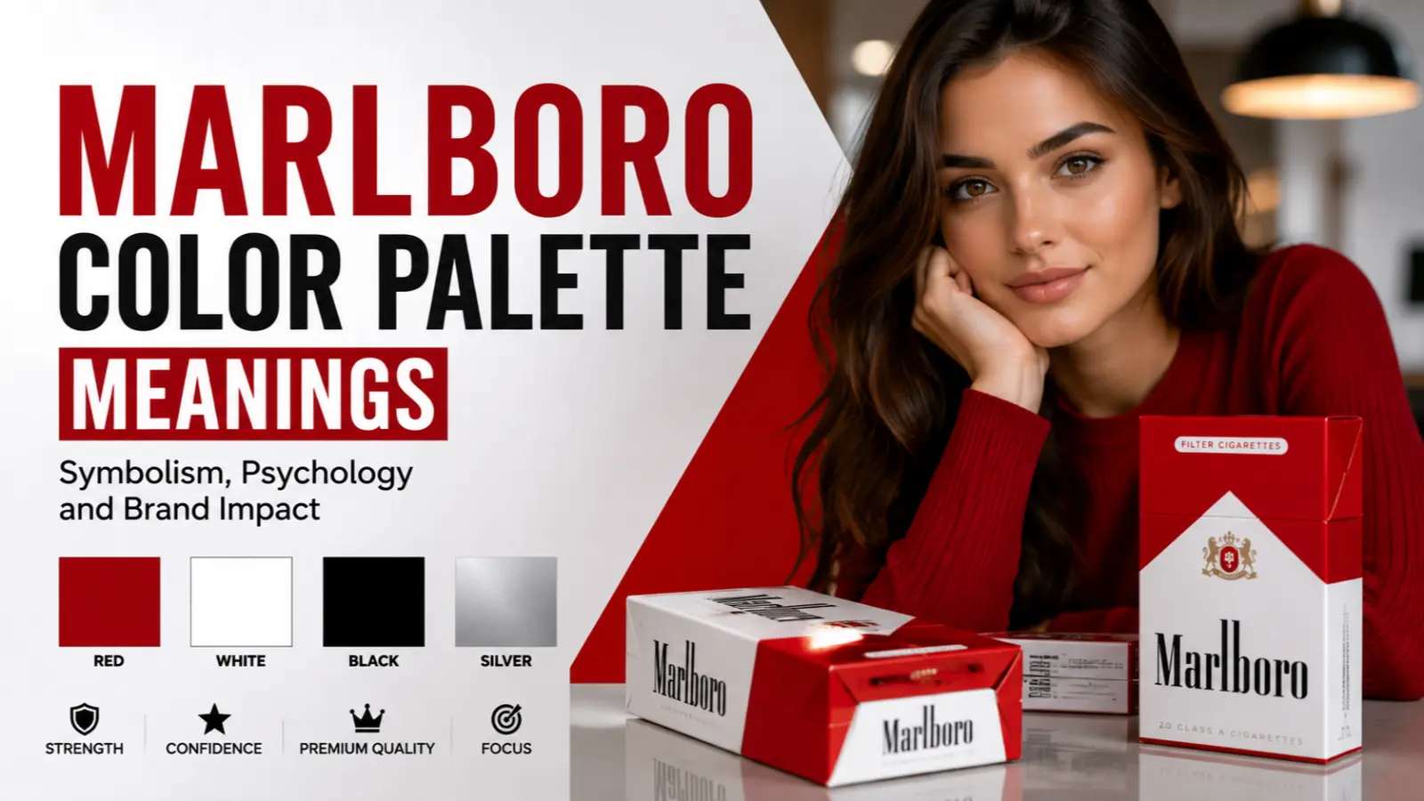
The Marlboro color palette is one of the most recognizable brand color combinations in the world. Rather than representing a single color, it combines bold red, clean white, black, and metallic silver to communicate strength, confidence, premium quality, and timeless simplicity.
Over decades, this palette has become associated with bold marketing, memorable packaging, and a rugged brand identity. While these colors carry broad psychological and cultural meanings, their interpretation also depends on context, culture, and personal experiences.
Understanding the Marlboro color palette meanings helps explain why this combination remains visually influential across branding and design.
Quick Answer:
The Marlboro color palette primarily symbolizes confidence, energy, purity, sophistication, authority, and premium quality through its combination of red, white, black, and silver.
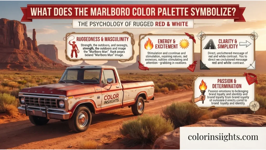
What Does the Marlboro Color Palette Symbolize?
The Marlboro color palette symbolizes a carefully balanced blend of power, simplicity, trust, and sophistication. Each color contributes a unique psychological message while strengthening the overall brand identity.
- Red symbolizes energy, passion, courage, excitement, and confidence.
- White represents simplicity, cleanliness, honesty, and clarity.
- Black conveys authority, elegance, prestige, and strength.
- Silver suggests innovation, refinement, modernity, and premium craftsmanship.
Together, these colors create a visual identity that feels bold yet balanced. Designers often study this palette as an example of how contrasting colors can improve recognition while reinforcing consistent messaging.

Psychological Characteristics of the Marlboro Color Palette
Color psychology suggests that people rarely respond to a palette as individual colors alone. Instead, they react to the emotional effect created by the combination.
Emotional Associations
- Confidence
- Determination
- Strength
- Reliability
- Luxury
- Simplicity
- Independence
- Prestige
Psychological Effects
The combination of bold red and neutral white naturally attracts attention while maintaining readability. Black adds authority, while silver introduces a refined, contemporary appearance.
Positive Emotional Responses
- Encourages confidence
- Creates strong brand recognition
- Suggests premium quality
- Communicates bold leadership
- Builds perceptions of reliability
Negative Emotional Responses
- Red may appear aggressive when overused.
- Black can seem intimidating or overly serious.
- Strong contrast may feel overwhelming in some designs.
- Premium styling may appear exclusive or less approachable.
Impact on Mood and Behavior
People often perceive this palette as energetic and decisive. It can encourage quick attention, increase visual recall, and create an impression of confidence and professionalism.
Typical Reactions
Consumers frequently describe this palette as:
- Bold
- Classic
- Powerful
- Clean
- Memorable
- Premium
- Confident
Spiritual Meaning of the Marlboro Color Palette
Although the Marlboro palette was created for commercial branding rather than spiritual symbolism, each color carries traditional symbolic meanings found in various spiritual and cultural traditions.
- Holiness: White commonly symbolizes purity and sacred intentions.
- Wisdom: Silver often represents maturity, knowledge, and higher awareness.
- Purity: White reflects innocence, truth, and moral clarity.
- Transformation: Red symbolizes courage and personal growth through action.
- Healing: White is frequently associated with emotional cleansing and renewal.
- Protection: Black represents resilience, grounding, and protection against negativity in several traditions.
- Power: Red and black together commonly symbolize authority and determination.
- Enlightenment: Silver reflects insight, intuition, and spiritual awareness.
- New Beginnings: White symbolizes fresh starts and opportunities.
- Eternity: Silver and white are sometimes linked with timelessness and continuity.
These meanings vary across cultures and should not be viewed as universal interpretations.

Positive and Negative Meanings of the Marlboro Color Palette
Positive Meanings
The Marlboro color palette conveys numerous positive associations depending on context.
- Purity: White backgrounds communicate cleanliness and transparency.
- Peace: Balanced white space creates visual calm.
- Simplicity: Limited colors make information easy to understand.
- Clarity: High contrast improves readability.
- Freshness: White creates a crisp, modern appearance.
- Hope: Bright colors often suggest optimism and progress.
- Balance: Neutral tones balance the intensity of red.
- Harmony: The palette creates visual consistency across products and advertising.
Real-world example:
Luxury packaging often combines white, black, and metallic accents to create a premium appearance while maintaining simplicity.
Negative Meanings
The same palette may communicate less desirable impressions in certain situations.
- Emptiness: Large white spaces may appear plain or unfinished.
- Isolation: Heavy black can create emotional distance.
- Coldness: Minimalist designs sometimes feel less personal.
- Sterility: Excessive white may resemble clinical environments.
- Boredom: Limited colors can appear repetitive.
- Emotional Distance: Strong geometric layouts may reduce warmth.
- Perfectionism: Highly polished branding can seem unrealistic or unattainable.
Real-world example:
A website using mostly black and white without supporting colors may appear elegant to some users but overly formal to others.
Meanings of the Marlboro Color Palette
The meaning of the Marlboro color palette changes depending on how and where it is used. Marketing, interior design, fashion, and cultural traditions each emphasize different symbolic qualities.
Feng Shui
In Feng Shui, this palette combines several energetic principles.
- Associated elements: Fire (red), Metal (white and silver), and Water (black).
- Energy symbolism: Motivation balanced with structure and stability.
- Best rooms: Home offices, entryways, creative studios, and modern living rooms.
- Recommended combinations: White with silver softens red, while black provides grounding.
- Decorating tips: Use red as an accent rather than a dominant wall color to maintain visual balance.
Marketing
The Marlboro color palette demonstrates how contrasting colors strengthen brand identity.
- Red attracts attention and creates urgency.
- White communicates honesty and simplicity.
- Black suggests authority and premium positioning.
- Silver adds sophistication and innovation.
- High contrast improves packaging visibility and logo recognition.
Many luxury, automotive, sports, technology, and premium lifestyle brands use similar color combinations to project confidence and quality.
Design
Designers appreciate this palette because it balances energy with simplicity.
Interior Design
It creates modern spaces with bold focal points while maintaining clean lines.
Graphic Design
The high contrast improves readability and visual hierarchy.
Web Design
Red works well for call-to-action buttons, while white backgrounds improve usability.
User Experience
Clear color contrast helps users locate important information quickly.
Minimalist Aesthetics
Limited colors reduce visual clutter while creating a polished appearance.
Fashion
This color combination remains timeless across many clothing styles.
- Clothing symbolism: Confidence, elegance, and modern style.
- Seasonal use: Works well throughout the year.
- Styling effects: Red becomes the statement color while black and white provide balance.
- Personality impressions: People may appear confident, organized, and stylish.
- Advantages: Easy to coordinate, versatile, and visually striking.
- Disadvantages: Excessive red may dominate an outfit, while too much black can feel formal.
A practical example is pairing a white shirt, black trousers, and a red accessory for a balanced professional look.
Color Associations Are Not Universal
Western Cultures
In many Western countries, red represents excitement, courage, and passion. White commonly symbolizes purity and honesty, while black often communicates elegance or authority.
Eastern Cultures
Several Eastern cultures associate red with prosperity, celebration, and good fortune. White may symbolize mourning in some traditions, giving the overall palette different emotional associations.
Religious Traditions
Religious symbolism varies widely. White often represents holiness and spiritual purity, while red may symbolize sacrifice, devotion, or divine love depending on the faith tradition.
Historical Interpretations
Historically, red has represented military strength, leadership, and royalty in many societies. Black has symbolized both authority and mourning, while silver has reflected wealth and craftsmanship.
Modern Global Interpretations
Today, globalization has broadened color meanings. Many people now associate the Marlboro-style palette with bold branding, premium products, minimalist design, and strong visual recognition rather than any single cultural interpretation.

What the Marlboro Color Palette Says About Your Personality
People who prefer this color combination are sometimes associated with certain personality tendencies. However, color preferences alone cannot accurately determine personality.
Possible Strengths
- Confident
- Determined
- Independent
- Practical
- Ambitious
- Organized
- Goal-oriented
Possible Weaknesses
- Competitive
- Perfectionistic
- Reserved
- Impatient
- Strong-willed
Social Behavior
They may enjoy taking initiative, communicating clearly, and presenting themselves confidently.
Work Style
Many prefer structured environments, measurable goals, and efficient decision-making.
Relationships
They often value honesty, loyalty, and consistency while appreciating partners who respect independence.
Emotional Tendencies
The combination may appeal to people who enjoy balancing excitement with stability and simplicity.
Remember that personality develops through genetics, upbringing, experiences, culture, and environment. Favorite colors reflect preferences but do not scientifically predict character.
FAQs:
What defines the Marlboro color palette?
The Marlboro color palette combines red, white, black, and silver to create a bold, premium, and highly recognizable visual identity.
What does the Marlboro color palette symbolize?
It symbolizes confidence, strength, simplicity, authority, sophistication, and premium quality.
Why is the Marlboro color palette important?
Its consistent use demonstrates how strategic color selection can improve brand recognition and consumer recall.
Is the Marlboro color palette warm or cool?
It combines both. Red is a warm color, while white, black, and silver function as neutral colors that balance the overall appearance.
What emotions does the Marlboro color palette represent?
It commonly evokes confidence, excitement, determination, reliability, sophistication, and professionalism.
What does the Marlboro color palette mean spiritually?
Depending on tradition, it may represent courage, purity, protection, wisdom, renewal, and personal transformation.
What colors pair well with the Marlboro color palette?
Gray, charcoal, navy, metallic silver, beige, and natural wood tones complement the palette while preserving visual balance.
What does liking the Marlboro color palette say about a person?
People who prefer it may appreciate confidence, simplicity, structure, and timeless design, although color preference does not reliably determine personality.
Is the Marlboro color palette effective in branding?
Yes. High contrast, strong visual hierarchy, and emotional symbolism make it memorable for logos, packaging, and advertising.
Can this palette work in home design?
Yes. When balanced with neutral materials and natural textures, it creates modern, clean, and visually striking interiors.
Conclusion
The Marlboro color palette meanings extend beyond branding into psychology, design, fashion, and cultural symbolism. By combining energetic red with clean white, authoritative black, and refined silver, the palette communicates confidence, quality, and timeless sophistication.
Although individual color meanings vary across cultures and personal experiences, this combination consistently demonstrates how strategic color selection can shape perception, improve recognition, and create memorable visual identities.
Whether used in marketing, interior design, or fashion, the Marlboro-inspired palette remains a strong example of balanced, high-impact color communication.